Key summary:
The Candlestick Chart was developed in the 18th century by a rice trader in Japan. At first, it was for commodity trading only, but soon began to be implemented worldwide. This chart’s focus is to dive deep into short term trading, including intraday charts or charts which use recent days’ events to forecast the near future. Therefore, it can cope with the practical pace of life, which is much more hurried than before. It can also go with (but not necessary) the Chart Patterns we discussed in Allocution 3 & 4, which need several months and can be combined with other theories or used individually. In simple terms, the investor can use Candlesticks for short term, medium-term and long-term purposes, but the concentration should be focused on the short term, as it is more useful when there is breaking through or pulling back in the market.
These days, there are two kinds of charts commonly used in the market: Bar Charts and Candlesticks. In comparison, Candlesticks are slightly more common than Bar Charts even though both use the same data to plot a chart which is open, high, low and close. The Bar Chart (OHLC or HLC) is sometimes known as the American Chart and the Candlesticks Chart is sometimes known as the Japanese Chart. In mainland China, this kind of chart is also known as a K-line, for the sound translation in Japanese is KYANDORU SUTIKKU, it starts with a K and that’s why it is named this way. This kind of chart is further developed into a Heikin-Ashi, as discussed in Allocution 3. The Japanese market also has another charting known as Renko Charts. The Japanese financial market is quite special compared to western markets, as it can be described as a ‘closed worldwide market’. About 88% of the trading in the Japanese stock market is with local capital – foreign capital makes up a much smaller percentage. However, this does not stop the market from generating worldwide attraction. When Candlesticks was first introduced, they were not that common because they use red to represent an intraday rise and black to represent a fall. At that time, colour printing was quite expensive, so later on changed to black and white, making it more common as the cost fell.
Before World War II, the financial market was just for noblemen, but as the economy blooms in the 1960s, people became aware of another market – the financial market, as opposed to just the typical weekly market they were used to going to for their weekly groceries. The Candlesticks Chart was then widely developed through the commodity market in Hong Kong in the 1970s and is now commonly used in every part of the world. In recent years, because of the adverse situation in Hong Kong, Tokyo has already surpassed Singapore and chased up Hong Kong. Another kind of chart known as Renko Chart is also developed by the Japanese but not so commonly used now. Investors are given a chance to see further research and development if they are interested in Japanese chartings.
But why is the Candlesticks Chart preferred over the traditional Bar Chart? Besides the profound short-term elaboration, there are many attractive and romantic terms like a shooting star, counterattack, three white knights…Lo and behold! Even though these terms are quite attractive, investors should not be swayed completely. They are correct, but the application is not so simple. The greatest risk is the problem usually does not lie in the chart, but actually in the reader. When readers want the market to rise, they sometimes just add on a beautiful name such as Single Day Turn to the situation, when actually it is not. Everyone can invent a beautiful and aggressive term and add it to the chart, but the market does not necessarily follow this special term inside the computer of a single investor. So investors must link up the chart with what is happening under the sun, or else everything will be in vain.
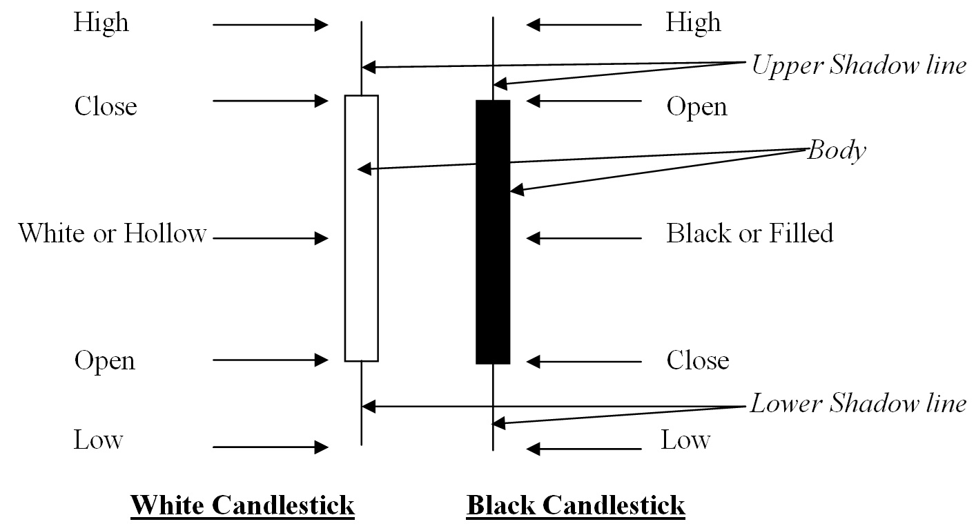
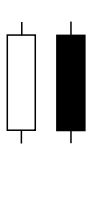
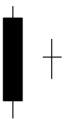
Figure (i) Basic Patterns
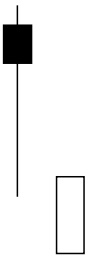
The basic pattern of the Candlestick chart can be started with white and black Candlesticks. White is also known as hollow and black as filled. The hollow or filled part is known as the body, real body or major body. The line higher than the body is known as the upper shadow line showing the high prices that day; the line lower than the body is known as the lower shadow line showing the low prices. So when the closing price is higher than the opening price, it will be shown as a white Candlestick; and when the closing price is lower than the opening, it will be shown as a black Candlestick. In the middle of the day, there will surely be some ups and downs, which will be discussed later.
Mind that it uses the same data of Bar Chart that are open, high, low and close but emphasises the intraday movement. Whether it is a white or black Candlestick no need to compare with the previous day or days, it depends on today only. So even the four elements of open, high, low and close are higher than the previous day, they still can be a black Candlestick, just depend on the same day’s opening and closing. On the other hand, when four elements of open, high, low and close are lower than the previous day, it still can be a white Candlestick, if the closing price is higher than the opening.
In North America, they use the colour of traffic lights to show the body of Candlesticks. When the closing price is higher, that is for a white Candlestick they would use green colour to show investors can go on; but when it drops, the black Candlestick will be shown in red colour, which means stop trading. However, in Asian countries like China, Korea, Japan, Taiwan, Hong Kong and Singapore, red colour denotes luckiness and happiness and is the colour for festival and joy, so it denotes a rise of that day which is white Candlesticks, and black Candlesticks will be represented by another colour.
However, in the personal computer or tailor made charts, investors can choose any colour they like. Even if entering into charts of other countries, just take a few seconds and keep calm, very easy to detect white and black Candlesticks. So do not mind so much about the colour, better concentrate on the essence as followings:
 | (1) Big White Candlestick It denotes the price rises from market opening straightly to market closing and the market sentiment being strong and turbulant. The opening price is the lowest and closing price is highest. Market velocity is strong and normally the rise will continue. A standard pattern should have no shadow lines over the closing or under the opening. It is known as Marubozu. As a rule, varients are more than standard patterns, so if there is a short shadow line just above the closing or under the opening, this will be considered as a Big White. |
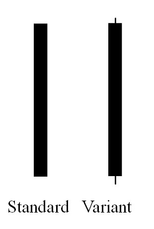 | (2) Big Black Candlestick It denotes the price drops from market opening straightly to market closing, where market sentiment is weak and in turmoil. The opening price is the highest and closing price is lowest. Market velocity is weak and normally the fall will continue. A standard pattern should have no shadow lines over the opening or under the closing. It is known as Marubozu. As a rule, vairants are more than standard patterns, so if there is a short shadow line just above the opening or under the closing, it still will be considered as a Big Black Candle. |
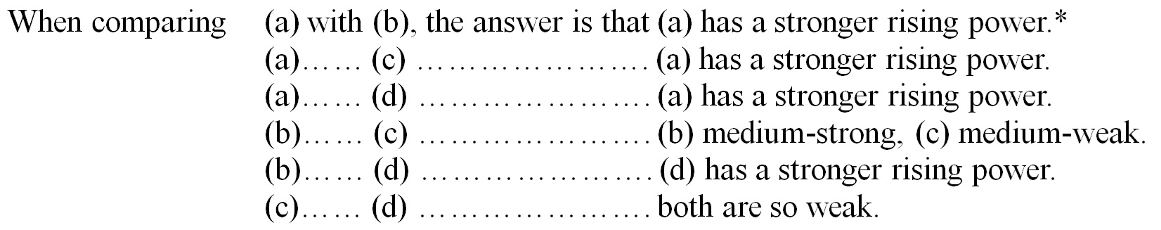
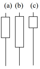
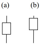
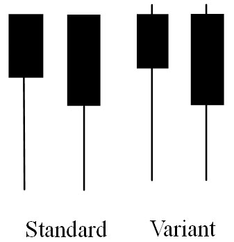 | (3) Anti-Falling Hammer After studying several electronic handouts we’ll now put you to the test. There are two Anti-Falling Hammers here, but which one has a stronger anti-falling power? Don’t mind the standard and variant patterns, they are the same. Don’t look at the answer first, just say whether the left-hand side pattern (with longer shadow line) or the right-hand side (with shorter shadow line) is stronger. Above all, give the reason why. Don’t fix it by luck, but by reasoning. There is a long elaboration underneath. |
The answer is a little complicated, since all chart analysis is based on a daily chart we have to go inside the intraday chart to analyse it. Actually, both patterns can draw two different intraday charts.
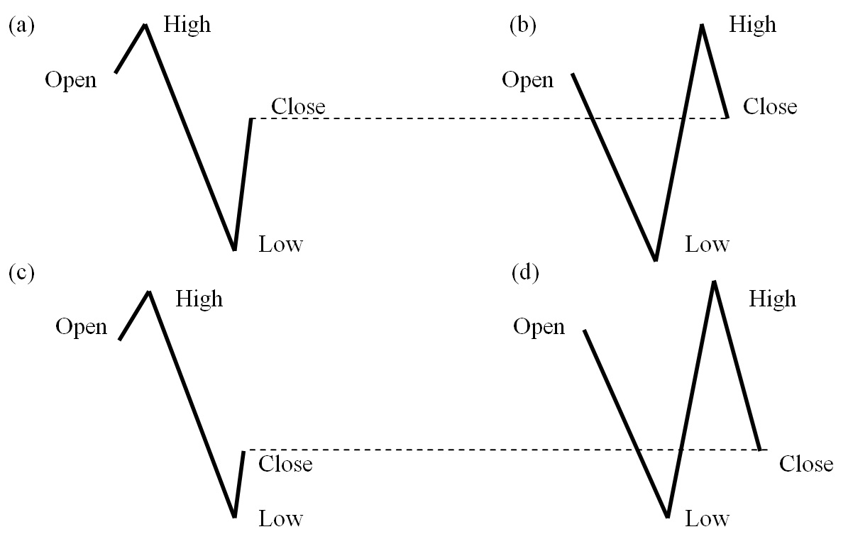
Figure (ii) Four Anti-Falling Hammers
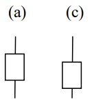
The above four figures are all using the variants for elaboration and put aside the standard patterns because they rarely happen, most of the practical situation are variants. The longer leg pattern for example, can have two different market conditions but turn up to be the same chart, so we must go inside the intraday chart to observe them, as shown in Figure (a) and (b). The shorter leg pattern can also have two different conditions, as shown in Figure (c) and (d). What is important is to have a focus on the closing price and last trend.
Figure (ii – a) shows the longer leg variant. After market opening, the price goes up slightly to the high and then has a big drop to the low, before rebounding greatly to market closing. This rebound is considered strong, and above all, after market closing nothing can be changed. Therefore, in such a case, the anti-falling power is considered strong. But in Figure (ii – b), after market opening it drops, and then we witness a more powerful rebound before it drops again before the market closes.
Even if in mid-session, it has a stronger rebound before market closing, therefore, it has already turned down and eliminated the power. Before the market closes it has dropped, even though the span is not as great as mid-session. But in the financial market, things happening nearer are of more importance. That trend before market closing normally will be considered more important than mid-session. So when talking about the longer leg pattern, we have two conclusions, first is (a) has a stronger anti-falling power than (b). What is the second?
In Figure (ii – c) we see the shorter leg variant. After market opening the price goes up slightly to the high and then has a big drop to the low before rebounding slightly to market close. This rebound is considered weak. Therefore, in such a case, the anti-falling power is considered as weak. But in Figure (ii – d), after the market opens we see a great drop and then a more powerful rebound, before it then drops down again before market close. Even if it has a stronger rebound in mid-session, before market closing, it has already turned down and eliminated the power. By dropping before market close, even though the drop is quite great, it has eliminated the great rising power in mid-session. In the financial market, things happening nearer are of more importance. That trend before market closing normally will be considered of more importance than mid-session. So when talking about the shorter leg pattern, in short we can say both (c) and (d) are of a weaker anti-falling power.
The simple answer of this test should be the “left-hand side pattern”, that is the longer leg has a stronger anti-falling power. But if we want to have a further comparison for deeper understanding and academic research, we can look to make the following comparison:
(a) and (b) are on first grade, (c) and (d) are on second grade even all are denoting rising.
The purpose of this test is not for you to get the right answer, but rather to get the correct reason. For a practical live market, the correct answer is always more than one, but the basic reason will not change. Once the investor can hold of the main reason, they can apply it to every other pattern. So there is no need to memorise or recite all of the patterns one by one. Instead, we have to understand the basic reason, thus investors can invent more beautiful and attractive terms on their own.
A good memory is important, but a thorough understanding is of higher importance.
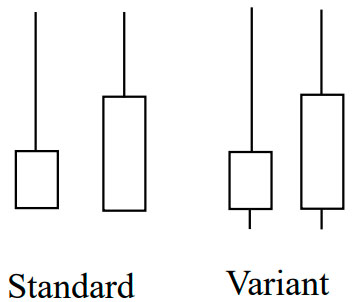
 | (4) Rising Hammer This pattern conceals another pattern inside that we have to study in a form of Anatomy; we must go into the 4 basic patterns before discovering the 5th. The standard and variants are the same. Apparently, the left-hand side with a longer leg has a stronger rising power. It shows us that it will continue to rise for several days if it’s strong enough. So where it the 5th pattern? |
We enter directly into the variant; put aside the standard pattern first.
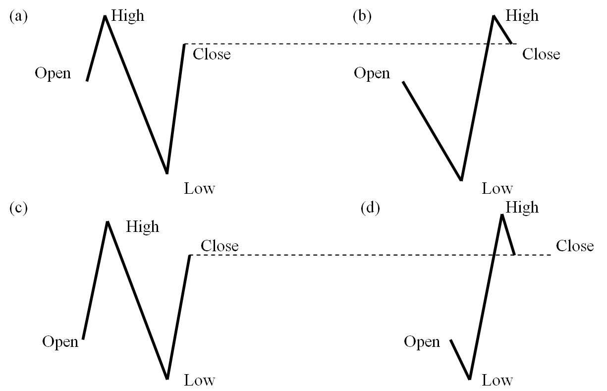
Figure (iii) Four Rising Hammers
For Figure (iii – a) after market opening, we see that it rose a little and dropped greatly, but also rebounded and therefore the closing price is higher than the opening. For Figure (iii – b), it dropped greatly after market opening and rebounded strongly, before retreating a little on market closing. Therefore, do not be distracted by the slight uptrend of (a) in the beginning and the slight downtrend of (b) at the end. Whether they exist or not is not so important, both (a) and (b) have a special term known as Single Day Turn. This is a very attractive term that denotes gloomy days are gone and sunny days are coming. But hang on! This is a special pattern and different from others. Normally Candlesticks will not look at the past and regardless of whether it is a black or white Candlestick, it will only depend on itself. But the term is called Single Day Turn, therefore we must know the trend in order to know which direction it “turns”. It is a reverse signal – if there is no downtrend, it will not turn, if it has already been in an uptrend, then there is no need to turn, or the turn is a “false” turn. Additionally, alongside the false turn, we also have an “unsuccessful” turn.
This is where the trend has been falling for a certain period and there is a great drop, however, what comes after is a strong rebound which could see it rocket over its original opening price. In such a case, whether it has a small rise at the beginning or a small adjustment at the end is not so important; this is how it is in a live market. We have to focus on the main trend. But we have not yet finished on market closing – we still have to observe what will happen next.
On the following day, when the closing price is higher than the turning day, we call it a successful turning, or else it will be an unsuccessful turning. That means the official buying signal occurs on the closing of the second day, and actual buying should be on the opening of the third morning, or at least shortly before the close of the second day if it is strong enough. The Single Day Turn is a very aggressive and romantic term, always giving hope to investors, with many of them holding the long position by the end of the first day. This is risky because they do not know whether that turn is successful or unsuccessful. So, the questions now are, how long should we observe the past trend and how long will it last in the future trend? We still need to cope with Wave Theory, Patterns and other Technical Indicators. Whether the Single Day Turn is an indicative pattern or misleading pattern depends on the observation of the investor and not the pattern itself.
So, as for the original 4 patterns, how can we compare and evaluate each one against the other? We can come to the basic theory.
* (a) and (b) are on first grade, (c) and (d) are on second grade even all are denoting rising.
If investors can understand the basic theory, even if chartists invent new terms in the future, it will not be a problem as they will easily be able to overcome this Presently, even the opposite pattern or mirror pattern can be easily understood at once and there is no need to memorise, but only to understand . As in the following patterns, clumsy reverse o r mirror pattern s avoid being repeated or else reader s may feel that they a re monotonous and tedious .
 | (5) Anti-Rising Hammer After a longer trend of rising and observing such an Anti-Rising Hammer, this means the rising will end soon but not necessarily now. It means the span of rise is diminishing. The longer the tail, the higher the accuracy; this trends shows after opening it continues to rise, but before closing will retreat. But the drop is not as strong and still above the opening, and if the following day the Falling Hammer of (6) comes, the power will be stronger. |
 | (6) Falling Hammer Basically it’s a trend of rising first but dropping later; a signal appears to show the turning point is near. The seller grows stronger gradually but not all at once. When after a long-term uptrend it’s more prominent. The longer the tail the higher the accuracy, it’s the downward version of a Single Day Turn and needs to be confirmed by a lower closing price of the following day. Please refer to (4) Rising Hammer. |
| (7) Struggling High It represents a fierce intraday struggling between buyers and sellers, but at length buyers win. If it happens after a long-term rising trend, it is indicating that the rise will end soon, but is still a little away. Actually, it is a warning signal and investors should stand by for a fall. That means if having profit should take profit at once and leave the market. When there’s no profit they should lower the target and wait for a while, whilst preparing their next move when the target is unreachable. When newly entering the market they should be as short-term as they can be and not hold too long, for the effort of buyer is being challenged. However, this pattern needs a larger transaction volume to confirm. | |
| (8) Struggling Low It represents a fierce intraday struggling between buyers and sellers, but at length sellers win. If it happens after a long-term falling trend, it is indicating that the fall will end soon, but is still a way away. Actually, it is a warning signal and investors should stand by for a rise. That means if having profit they should take profit at once and leave the market. When no profit they should lower the target and wait for a short while whilst preparing their next move when the target becomes unreachable. When newly entering the market it should be as short-term as can be, and they shouldn’t hold onto anything too long for the effort of seller is being challenged. However, this pattern needs a larger transaction volume to confirm. | |
| (9) Little White Line When compared to or just after the (7) Struggling High, it is a step nearer the end. May be as close as the following day, even though sometimes there will be a short wait, it will at least experience a significant rise the following day. Sometimes it does not need another pattern and can go directly into a downtrend. So even the long positions do not have profit but still have to sell or else their loss will be even greater. It shows that after a fierce struggle both buyers and sellers remain cautious and will not let the price fall too far from the opening price. Market movers do not want to face too high a risk and neither does an investor. | |
 | (10) Little Black Line When compared to or when it goes just after the (8) Struggling low, it is a step nearer the end. May be as close as the following day, even though sometimes there will be a short wait, it will at least experience a significant fall the following day. Sometimes it does not need another pattern and can go directly into an uptrend. So even the short positions have not profited and have to buy back or else the loss will be even greater. It shows that even after a fierce struggle both buyers and sellers remain meticulous and will not let the price drop too far from the opening price. Market movers do not want to face too high a risk and neither does an investor. |
 | (11) White Body, Black Body This represents a medium size body, longer than (9) Little White Line & (10) Little Black Line, but shorter than (1) Big White Candlestick and (2) Big Black Candlestick, and roughly the size of (7) Struggling High & (8) Struggling Low, however, the shadow lines are very short or non-existent. Practically, it denotes a midway pattern. If the trend is rising and a white body is found, that means it will carry on rising. However, if a black body is found then you have to wait and see what will happen next. If falling then vice versa. Anyway, white indicates that the uptrend will carry on, whilst black indicates the downtrend will carry on. |
| (a)
| (12) Doji (a) Small Star Doji star is also known as Small Star, mini star or tiny star. This is when the opening price equals the closing price and the range between high and low is quite narrow. It can be seen in most of the places, including top, bottom, or middle part of a wave. It shows that the velocity of the wave is growing from vigorous to calm and it is actually a get ready signal. When it appears on bottom or top of a wave it indicates that a reversal is near, but in a lot of cases it has to be used with other sticks. |
| (b)
| (13) Doji (b) Long Leg Star Long Leg Star is sometimes known as long cross. It tells us that the intraday fluctuation is quite large but regardless the closing price returns to opening. This means that the market situation is growing from vigorous to calm. So the following day we still have to observe whether the span is large or small so as to determine the calm down position. |
| (с)
| (14) Doji (c) Upper Cross Upper Cross actually is a variant of the Long Leg Star, but the opening and closing prices are on a higher level, however, be careful that they’re not at the top as this will be another pattern, as shown in (16). Even though it denotes the calming of a market situation, it still clings towards an upward no matter whether on top or bottom of a wave. |
| (d)
| (15) Doji (d) Lower Cross This shows the downward power is stronger, meaning that if it is at the bottom of a wave, the chances of it falling are greater, even though it is a reversal signal and still go up. The time is needed is longer, but if it appears on top of a wave then the turning point will be quite near. Please make sure that the opening and closing are not on the bottom as this will show another pattern, as shown in (17). |
From (12) to (15) are four kinds of Doji, they can be used alone, but please refer to other sticks. All four of these are get ready signals only, and you cannot be sure they will reverse the following day, but they might be very close. Hereafter, they will be more explicit as they are one of the elements that form other patterns and are widely used.
 | (16) Dragon Fly Doji It is formed when the opening and the closing prices are at the highest point of the day. It denotes a fierce fighting between buyers and sellers and if it has a longer lower shadow it signals the future trend will go up further. When appearing at market bottoms it is considered to be a reversal signal, but slightly weaker than the Single Day Turn. Please do not confuse this with the previous Upper Cross. |
 | (17) Gravestone Doji It is formed when the opening and the closing prices are at the lowest of the day. It denotes a fierce fighting between buyers and sellers and if it has a longer upper shadow it signals the future trend will go down further. When appearing at market tops it is considered to be a reversal signal, but again the signal is not as strong as the Single Day Turn. Please do not confuse this with the previous Lower Cross. |
Sudden Test
 | (18) Hanged Man Please refer to (4) Rising Hammer (a) and (b), as it shows that the longer the shadow line, the stronger the rising power. What happens to (c)? Thus we say the length of (b) is short, the hammer and the shadow line is at a ratio of under 1:1, but in (a) it is long, the ratio is 1:2 so has a stronger rising power. But in (c) it’s the longest, in the ratio of 1:4 or over. What will happen? Above all WHY? This is another sudden test, the answer will be shown in the Complex Pattern (25) to (28), but not so simple. Don’t look at the answer, think first. |
The Basic Patterns are all simple patterns, that means the reader can study or use them on their own, while the next topic is Complex Patterns, at least two or three or more Candlesticks should group together to observe, which is in a more complicated level. The writer would not encourage investors to memorise these beautiful terms and patterns and recite them one by one, instead a sudden test will be a good way to improve understanding. Understanding power is always more important than memorising power.
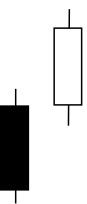
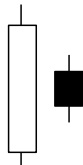 | (19) Bearish Harami It consists of a big White Candlestick followed by a small Black Body (contained within large White Body). It is considered as a bearish pattern when proceeded by an uptrend. In application, this is more accurate in a stock market situation than in gold or currency markets. |
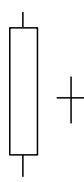 | (20) Bearish Harami Cross It has a large White Body followed by a Doji and is considered as a reversal signal when it appears at the top of a wave, no matter how small, medium or large a wave. In application, it is more accurate in the stock market than in gold or currency markets. |
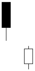
 | (21) Engulfing Bearish Line It consists of a small White Body that is contained within the large Black Candlestick. It is considered as a reversal signal when it appears at the top of a wave, no matter how small, medium or large a wave. When applied it is more accurate in the stock market than in gold or currency markets. |
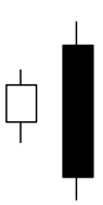
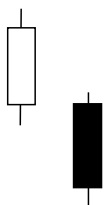
 | (22) Bullish Harami It has a large black body followed by a White Body. It is considered as a reversal signal when it appears at the bottom. When applied it is more accurate in stock market than in gold or currency markets. |
 | (23) Bullish Harami Cross It has a large Black Body followed by a Doji. It is considered as a reversal signal when it appears at the bottom. When applied it is more accurate in stock market than in gold or currency markets. |
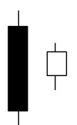
 | (24) Engulfing Bullish Line It consists of a small black body that is contained within the followed large white candlestick. When it appears at bottom it is interpreted as a major reversal signal. In application, mind that it is more accurate in stock market than in gold or currency markets. |
 | (25) Hanged Man (a) A white candlestick that consists of a small body near the high with little or no upper shadow and a long lower tail. The shadow line in relation to the hammer should be in the ratio of 1:3 or 1:4 or more. Considered a bearish pattern during an uptrend. Things will reverse when pushed too far. Please compare with (4) Rising Hammer which states the longer the tail, the stronger the rising power. But now the tail is too long and would just lead to a fall. |
 | (26) Hanged Man (b) When a man is hanged to death he drops down at last. That is the confirmation. That means when this pattern occurs, it still needs a confirmation. So, the next day the closing price should be much lower than the original day. The body can be black or white, the Candlestick can be large or small, but the highest point should be near the lower end of the tail. Thus, the pattern is confirmed. Without confirmation the pattern is a false pattern. |
 | (27) Hanged Man (c) A Hanged Man can be in black body or white body, both are accepted, but if the original body is in white, do not misinterpret as a Single Day Turn, for it is at top of a wave and only denotes that there is still time to rise a little or that the falling power is as strong. A white body Single Day Turn will only occur on bottom of a wave. But if the body is black, it can be a Variant of the Single Day Turn. Regardless of this, the term is not important. No matter whether it’s a Black Single Day Turn or Hanged Man, both denote falling and also need confirmation. |
 | (28) Hanged Man (d) The confirmation means on the following day the opening and closing prices are much lower than the original, including the highs and lows, which are much lower. That is another Candlestick apparently and totally at the lower side of the shadow line without any upward trend. The confirmation can be in the form of a small, medium or large Candlestick. Of course, large denotes a great fall, small a lesser fall, whilst Black body denotes it will drop further, deeper, and faster and white body shows it will still drop, but with less depth and speed. |
 | (29) White Spinning Top Basically it is a small white body with short upper shadow line and lower shadow line. The name comes from the famous fairytale Sleeping Beauty where sleeping denotes a sluggish or stagnant market condition. Actually, it is a neutral pattern. Please refer to Symmetric Triangle of Allocution 3 Chart Patterns (A). But a chart pattern needs two to three months to develop, while a Candlestick only needs one day of transactions. (a) is the standard pattern of Spinning and (b) is the body clinging upward, known as the White Spinning Top. |
 | (30) White Spinning Bottom This time (a) is still the standard pattern the same as in item (29), but the (c) is called White Spinning Bottom. It denotes that even the power is weak and market sentiment is indecisive, but (29) is a little stronger than (30). Practically, even investors who understand that the current market sentiment is indecisive, want to know which side it is clinging to. Of course, they must cope with other factors. It would be useful in the Hikkake Patterns of (78) and (79) in Allocution 6 to find out traps. |
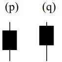 | (31) Black Spinning Top Besides the period of formation, Spinning Top is different from a Symmetric Triangle because it is divided into black and white. Even though both of them denote running back and forth within a short range, the White Spinning Top of course is clinging to an uptrend whilst the Black Spinning Top is clinging to a downtrend. However, we must observe the other sticks as opposed to just the individual stick itself. (p) is the standard pattern of Spinning Top and (q) is the Black Spinning Top. |
 | (32) Black Spinning Bottom This time (p) is still the standard pattern the same as in item (31), but the (r) is called Black Spinning Bottom. It denotes even the power is weak and even market sentiment is still indecisive, but (31) is a little stronger than (32). Practically, even investors who know that the current market sentiment is indecisive want to know which side it is clinging to. Of course, they must cope with other factors. It would be useful in the Hikkake Patterns of (78) and (79) in Allocution 6 to find out traps. |
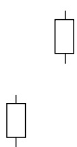
 | (33) Separating Lines Up In an uptrend, a Black candlestick is followed by a White candlestick with the preceding opening price. It is considered as a continuation pattern that the trend will resume. Mind that the size of the Candlesticks isn’t too large or too small. Small of course indicates weak power, but too large means overbought and can lead to a reverse. So, medium size is the best. |
 | (34) Separating Lines Down This is the mirror pattern of (33), there’s no need to memorize whether black or white is at the top or bottom but instead try to understand it rather than memorize it. The basic theory is that in a downtrend the White Candlestick is followed by a Black Candlestick with the preceding opening price, it is considered as a continuation pattern that the trend should resume. That is from black to white of course rising, white to black is falling – it’s simple logic. |
 | (35) Falling Windows It is also known Jumping Gap. A Falling Window is created when the high of the second Candlestick is below the low of the preceding candlestick. It is considered that the window should be filled sooner or later. Sometimes it will take several months for re-filling. The greater the gap, the shorter the period of refilling needed. Most of the time gaps will be refilled, but not 100%. For Falling and Rising Windows, the accuracy in stock charts is normally more than gold and forex charts. |
 | (36) Rising Windows It is just the reverse of the Falling Windows, also known as Jumping Gap -but don’t worry whether the stick is white or black and whether the shadow lines are long or short as it makes no difference at all. Also, there’s no need to have confirmation, therefore regardless whether the following sticks are black or white there’s no difference. When the gap is filled, it will carry on its direction. In this pattern it is rising, but better merge with other technical indicators and Wave Theory to have a comprehensive forecast. |
This Allocution contains elementary explanations of Basic Patterns (Single-stick acquaintance) and Complex Patterns (Two-stick patterns). Next Allocution will be concerning Advanced Patterns of three or more sticks. However, it is not the end, the last Allocution will be concerning Live Examples of the market and will be more down-to-earth than just repeatedly studying.