
Key summary:
Basically, the function of charting is to record all the past prices in various manners and present them in a clear way visually. This makes it clearer and easier to find out the highs and lows of a certain period without the need to go through figure by figure. A chart shows everything at once and can be easily referred to without keeping so many figures, especially in longer terms. Charts can be summed up daily, weekly or monthly to show the short term, medium term and long term trends. We also can use past records to forecast the future, since the scope of the market is infinitely large, therefore no one can guarantee patterns that happened in the past will surely happen again. As the famous Greek philosopher Heraclitus said:
“You cannot step into the same river twice, for other waters are continually flowing on.”
Heraclitus means that investors must be aware that times are changing and even if history repeats itself, things will never be 100% the same as before. When you apply this to chart analysis, it means that the patterns in the past will not necessarily to happen again in the future exactly, there are bound to be some differences due to either the current environment or some other background factors such as economic indicators or the international situation.
There are several types of methods when using the same data to plot a chart in the market, and thus the most commonly used are as follows:
Hereby is the Dow Jones Index of 14th Dec 2020, the same day situation presented in different chartings so that investors can have a comparison.
a) Candlestick
In the following Candlestick chart, the blue colour stands for the closing price of that day is higher than the opening price, meaning it has risen after market opening. The red colour stands for closing price of that day is lower than the opening price, meaning it has fallen. Details will be explicated in Allocution 4.
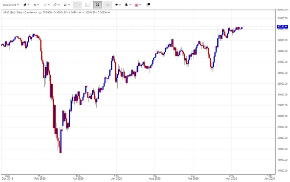
Figure (i) Candlestick
b) Bar Chart
Basically, Bar charts can be divided into two types – OHLC and HLC – in the following figures, showing the high, low, opening and closing price of that product.
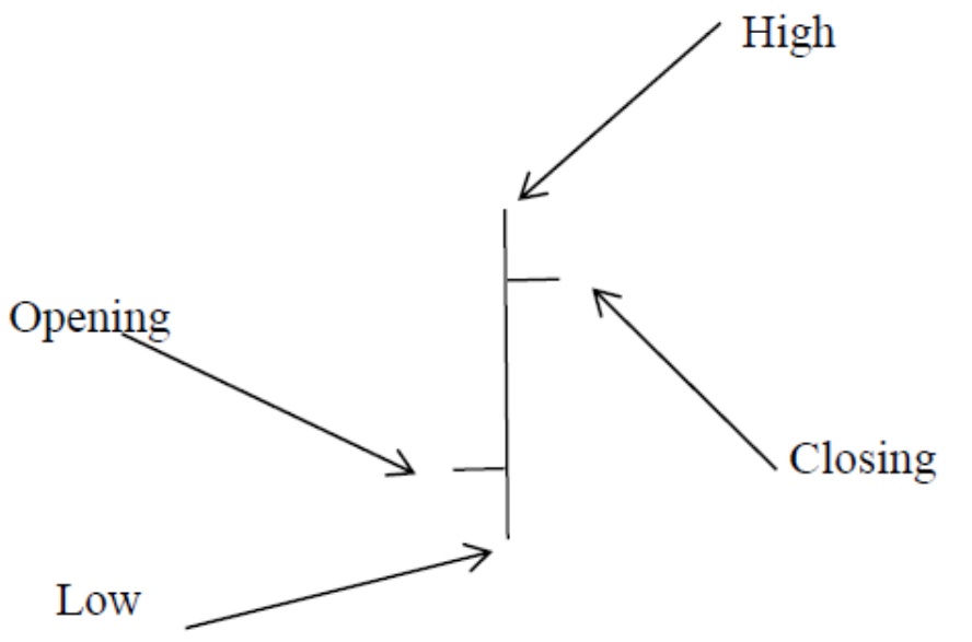 Figure (ii) OHLC | 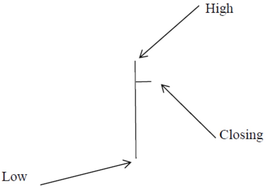 Figure (iii) HLC |
Both figure (ii) and (iii) are showing the same market conditions for the same product, recording the opening, highest, lowest and closing prices. If it is on a daily chart, each bar represents one day, but on a weekly or monthly chart, each bar represents one week and one month respectively. When the period is less than one day, they are known as intraday charts, which could be broken down by 8-hour, 4-hour, 2-hour, 1-hour, and 30 minutes intervals. All chart analysis is based on the Daily Chart for there is a genuine closing price, while for 1-hour or 2-hour charts or other periods the market carries on without stopping and it is the chartist who picks up the prices to draw a chart, with the closing price being for the hour as opposed to market closing. While for weekly and monthly, the market has already had been closed for every single day during that period, so investors should base their analysis on the Daily Chart. Apparently, figure (ii) of OHLC is providing more data than Figure (iii) HLC, but practically the former is rarely used in the market, with those using the Bar Chart choosing to use the latter, which is HLC. But why?
There are three major reasons. Firstly, in the market investor are most concerned about the nearest happening; the nearest price is the most important and has a greater effect than the previous prices. The closing price is the nearest and opening in comparison, is furthest and not as important. Secondly because of the speed when in network transmission or due to computer presentation, if it carries more data, the time needed to show up will be longer. Nowadays, users are impatient that even a delay of half or quarter of a second generates complaints and they may move to another provider. So they cut off unnecessary data, because if it is in a long term daily chart, for example 5 or 10 years, the data needed to transmit will be much more. Lastly, it is the most important point. Please refer to Figure (iv) and Figure (v) and see the difference between these two charts. They are the Dow Jones OHLC and HLC of the same period Daily Chart.
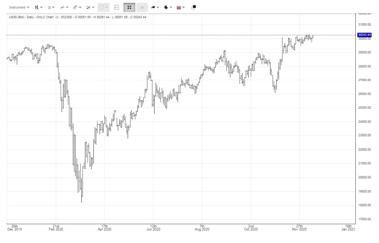
Figure (iv) Dow Jones OHLC
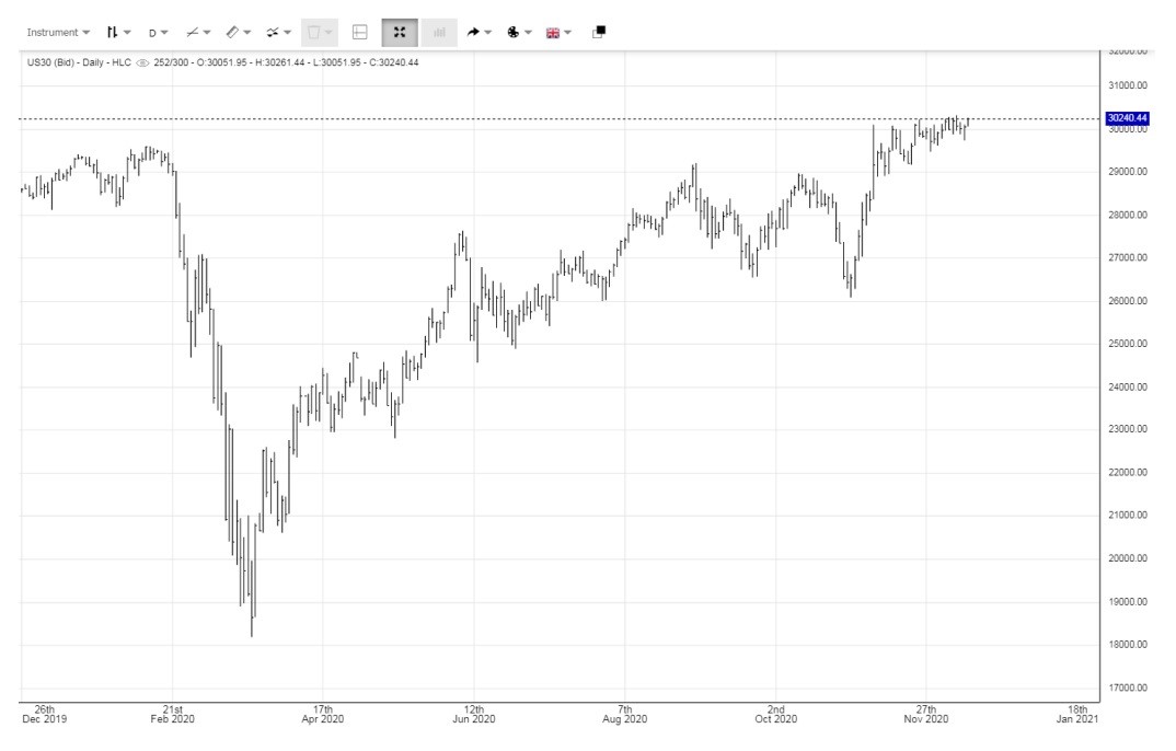
Figure (v) Dow Jones HLC
Correct! The difference is, there is no difference. Why? When you enlarge the charts as in figure (vi) you can see from the latest group of bars, the opening price is just the same as previous closing price, so it is not necessary to put them down again. OHLC equals HLC.
Figure (vi) Enlarged OHLC of Dow Jones
c) Dot chart
The Dot chart has no relation to the dot com bubble, this is just a coincidence in its name. Like in the Bar Chart or any other charts, the daily chart is so important because of its closing price, thus someone came up with the idea to just show the closing price to plot a chart and therefore the Dot chart was created! The idea is quite simply that it only shows the closing price represented as a dot and nothing more.
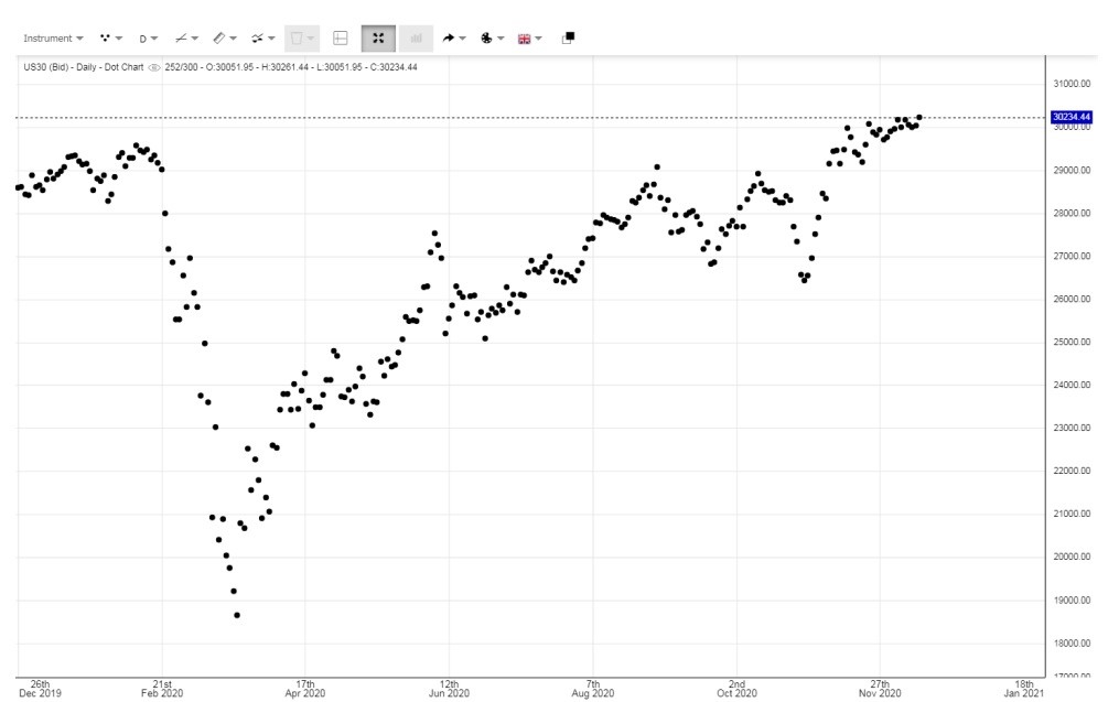
Figure (vii) Dot chart of Dow Jones
d) Dot and Line Chart
Since the Dot Chart sometimes may not be as clear, especially when the price is in a small range and therefore mixed together a line is used to link the dots so the trend is easier to see and the closing prices are also seen as dots.
Figure(vii) Dot and Line Chart of Dow Jones
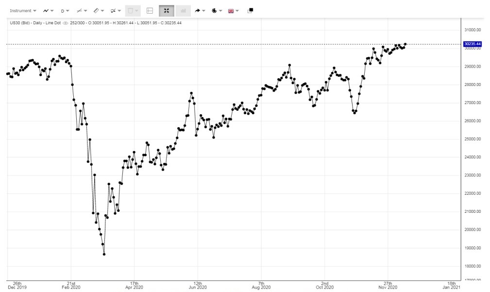
e) Line Chart
A Line Chart is used to link up all of the closing prices in a smooth way, without showing the closing price. It is used to show the trend only and not refer to any specific closing price, for the whole line is plotted by closing price.
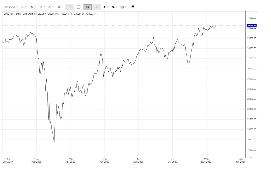
Figure (vii) Line Chart
f) Area Chart
Area Chart actually is based upon the line chart, but the area underneath the chart is shaded so that it is more apparent.
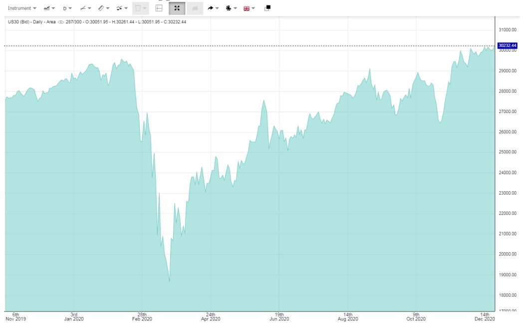
Figure (viii) Area Chart
g) Bar Forest Chart
The Bar Forest Chart is a little different in structure from the above charts. It uses the price of today as the core and when the price is lower than today this is represented by downward bars, whilst when the price is higher the bars are facing upwards. It therefore varies according to the changes. The aim is to show the position of today in relation to the previous prices. The price of today is the watershed. So the following charts would have great difference when the price of today is higher than previous. These are live charts on 15th December 2020 of Dow Jones, USD Index and gold respectively. Please refer to figure (ix – xi)
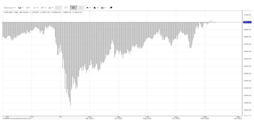
Figure (ix) Bar Forest Chart of Dow Jones. Since it keeps recording record highs recently, so the current price is on a very high level and all bars are heading downwards.
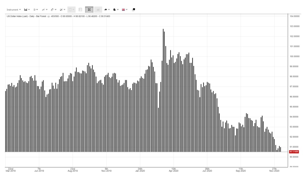
Figure (x) Bar Forest Chart of USD Index. Since it has been falling for quite a long time, on this day the index is at its lowest point, therefore, all bars are heading up. However, figure (ix) and figure (x) are really extreme examples. How about a medium example, it can be seen in figure (xi) below.
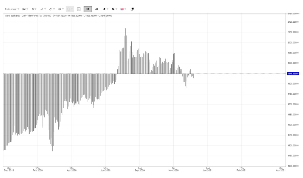
Figure (xi) Bar Forest chart of gold. As you can see the current price is in the middle, for it firstly rose and then fell from its high, it is roughly in the middle of the trend of the year, so the line of watershed is in the middle.
h) Heiken Ashi Chart
This is an average chart based on the Candlestick chart invented by the Japanese, again using the average of previous data to plot the chart. From the following formula concluded the figure (xii) shows when in down trends all Candlesticks are in red and uptrends in blue, for the calculation is based upon the previous closing price.
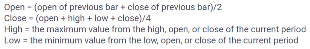
Figure (xii) Heiken Ashi Chart of Dow Jones
i) Renko Chart
Again, it is invented by the Japanese. Traditional charts are based on two elements – price and time – but Renko uses price over time. The move of price will determine everything and time is not so important. A new brick is created when the price moves a specified price amount, and each block is positioned at a 45-degree angle (up or down) to the prior brick. An up brick is typically coloured in blue and a down brick in red, as shown in the chart underneath. A brick can be any price size, such a $0.10, $0.50, $5, and so on. This is called the box size. It can filter out the noise and help investors see the trend more clearly, since all movements that are smaller and the box sizes are filtered out.
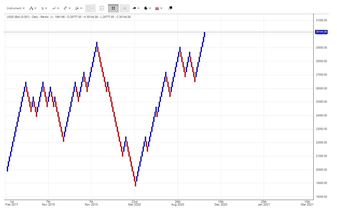
Figure (xiii) Renko Chart of Dow Jones
In summary, of course, there are other charts investors can use, but those are not as popular. Charts such as the point and figure chart were very commonly used in the 1980s because at that time there were no computers and graphs had to be drawn by hand only, thus such kind of chart would be very practical. Even though there are still quite many other chart presentations, the above charts demonstrate the basic and commonly used charts. Anyway, the Candlestick and Bar Chart are the most widely used charts nowadays and quite useful, so we should concentrate on them.
Chart analysis is used to forecast the market trend, how is it possible to forecast? This is because of investor market behaviour and speculators. Sometimes we can track and trace the market behaviour of the market Big Shots and know their intention from chart analysis. So, we can start from do re mi, when an investor wants to buy a product, there is often a situation when the future trend is not clear-cut. Thus they would discuss this with a broker. They want to buy now, but are afraid it will drop in the future; if they say do not buy, the investor would fear missing their chance and can never buy at such a cheap price. This is a common dilemma for any individual investor, whether they are an experienced investor or a beginner. Therefore, the investor may want to discuss an alternative way to position themselves to benefit should the market go up and prepare to be protected if the market falls. The best way is to divide their capital into two portions, buy one lot first, and then wait for a week before buying another lot to complete it. So if the market falls in next week, they can buy another lot at a lower price, even if the market rises immediately after buying, they already have one lot in hand and can also buy another lot the following week to balance it out. This is the general strategy for most individual investors.
But, how about Big Shots in the market? They have numerous lots to buy and therefore it may take two months as opposed to two weeks to finish their buying. During these two or three months, we can get spot hints using the chart to understand what a market Big Shot is doing.
If a Big Shot wants to buy a product, since their amount is tremendous, we call it collection, for it usually may take a time – up to two or three months. But if they keep on buying incessantly, they will push up the price, so the quantity they could buy will be less and less. Even if their capital is more than that of individual investors, it will still be limited. For example, if a fund manager makes investments on behalf of a fund, they will face keen competition from other fund managers both inside and outside the firm. They must use the least capital to maximize their profit. In order to make the buying cheaper and buy in a greater quantity, they will use Formula Buying. Before computers were around, formula buying was done manually. Now of course it is done by computer. This means that as they buy, the price will soar up and when it reaches a level they think is too expensive, they will sell a portion to push down the price and re-buy it at a lower and cheaper level. The following example shows the basic theory of formula buying.
| Period | Buy in | Sell out | Net Buying | Previous store | Total |
| Day 1 | +100 | -70 | 30 | 0 | 30 |
| Day 2 | +100 | -60 | 40 | 30 | 70 |
| Day 3 | +100 | -50 | 50 | 70 | 120 |
Our example shows that on Day 1, they purchased 100 lots and thus the price soared up, making them think it is too expensive. The budget is limited for everyone, even if they have a large amount of funds at hand, the portion allocated to a specific market is limited, with other funds generally allocated to markets such as gold or currency, so the investor must sell to push the price down. In this case, they sold 70 on market closing, leaving them with only 30 lots in hand. On Day 2, they again purchased 100, meaning the price soared. However, this time they did not sell out as much as they aim to do the collection, so they sell just 60 leaving 40 at hands plus 30 of the previous day. This means they have 70 lots at hand. On Day 3 they again purchase 100 lots but sell less, just 50 only, but when adding on to the previous lots, it will be 50 plus 70, which adds up to 120. This is the basic concept of Formula Buying and the lots of selling out will vary according to the market situation. If the price is high, they will sell out more and if low, sell out less. When a Big Shot is doing this, they usually do not make it public knowledge and will only discuss it with one or two close assistants. If investors can get the news from the Big Shot directly, it is quite nice, but if the information is disclosed from their assistant and he transferred the news to the manager, and the manager transferred to the officer, the officer transferred to his family and his family passed to his friends and then transferred to general investors, the news may take a long time to spread. Sometimes it may be very fast and sometimes it could be quite slow. Investors will not know either way and when the news reaches the investor, it could already be too late and be at a time of selling and not buying, for they may be the last to hear this news. If an investor can make sure they are the first one that gets such news, it will not be as big a problem. But who can do so? Only a few among the few. It is quite common when the news is being circulated that it is news of buying at first, but after a certain time, this news becomes outdated and actually, it will be news of selling. Therefore, it is better to track and trace it in a chart to know it beforehand. Individual investors, therefore, depend on chart analysis rather than the circulation of news.
So let’s see how it can be tracked and traced in chart analysis.
a) Ascending Triangle
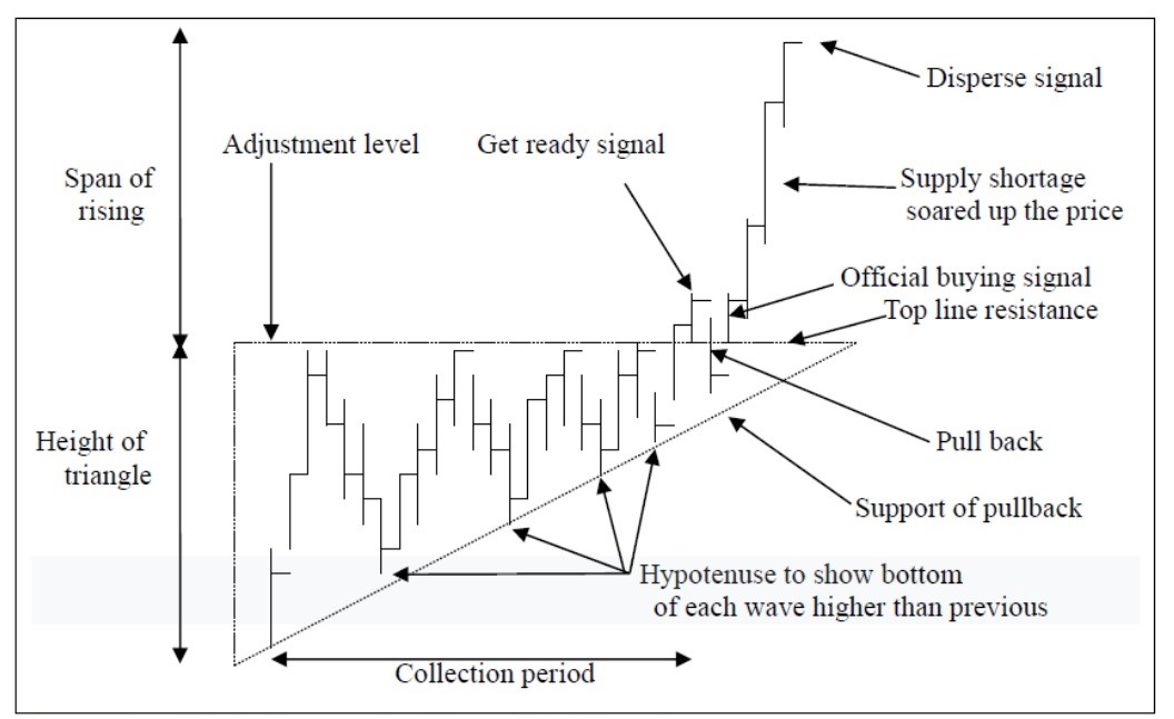
Figure (xiv) Basic theory of an Ascending Triangle
An Ascending Triangle shows the period of collection of a product, either from a single Big Shot or from a group of buyers. The principle is that they are using Formula Buying, as said previously. This means that they start buying at the low and when it reaches the designated level, they sell out a little to push down the price, but the basic theory is that they will not sell in excess, so the bottom of this wave should be higher than the previous one. And after several rounds of ups and downs, many stocks are collected in the hands of the Big Shot. Now there is a shortage on the market, and the price will pop up high above the level of resistance. This is a ‘get ready’ signal, sometimes there will be a pullback or drawback and other times there will not. Pullback occurs upon a shortage of supply, but when it happens, those that purchased the product at the low will rush to sell, for they had been waiting for quite a long time and every time the price has hit the resistance level, it has turned back. This is actually the digestion of selling orders. So during this period of collection, quite a number of people will have bought in and had an abundant profit when breaking through the top line at the point of sale, thus this pushes down the price inside the triangle. However, the resistance is still at the Hypotenuse, it will be a guide point of pullback. When the pullback has finished, it will continue to rise and the target of profit taking will be the height of the triangle. This is the basic theory and there is further explanation underneath.
In a practical case and dubbing in prices, it will be as follows. In the market of course there is not be just one buyer; there should be many buyers
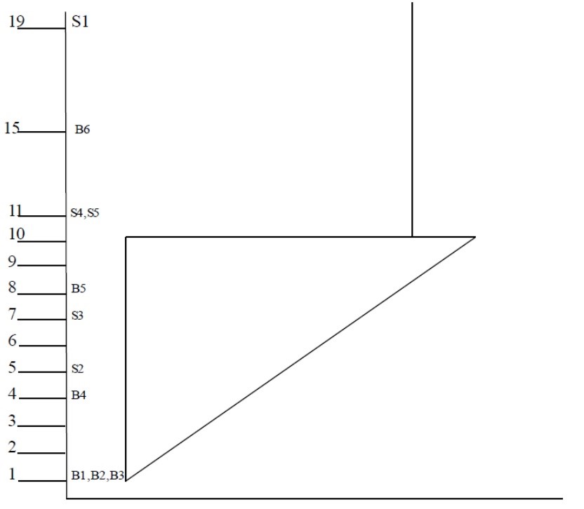
Figure (xv) Numerical value of Ascending Triangle
The Ascending Triangle is a pattern that describes the collection of a product and of course the collection will start at the low and not at the high. When the price is low enough, it will attract a lot of corporate buyers. So, at the starting point, Buyer 1, Buyer 2 and Buyer 3 entered the market at the level of $1, but of course, even though their starting points are the same, their targets are surely not. Some will aim at a higher level and some lower. Some buyers are stronger and some weaker. Let’s define the strongest buyer as Buyer 1. He is going to do a collection of that product and then will sell out at a high level.
When several buyers come together to buy the price is likely to go up, and when this happens, it will further attract Buyer 4 to come in at the level of $4. New capital entering the market further pushes up the price to $5. However, the target of Buyer 2 is just at $5, since they are just a small buyer and will not aim at a high price. When reaching the target, they will sell out the product and withdraw the cash to use elsewhere or invest in other markets. Originally, when Buyer 1, Buyer 2 and Buyer 3 started buying at $1, they would have been friends all working together. However, now friends have become enemies in the name of business and profit. Buyer 2 at once changes to Seller 2. Since the aim of Buyer 1 is to collect as much as they can, their target is placed at $10. So when under this price, they think it is very cheap and will buy at once without doubt. Therefore, they will totally absorb the quantity of Seller 2, and thus the enemy Seller 2 is kicked off from the market. They continue to buy and the price continues to go up to $7. The aim of Buyer 3 is at $7, and when reaching this target, they will sell. Buyer 3 thus become Seller 3, and again this enemy is kicked off by Buyer 1 for it is still cheap compared to their budget. The price continues to rise and further attracts Buyer 5 to come to the table. New capital coming into the market again pushes it up to $10. The upper limit of buying for Buyer 1 is $10, when above this they will consider it expensive, as they have already evaluated only to buy up to $10 and when above maybe use their capital to buy another product in the market. However, the quantity they wish to purchase is still not enough, therefore they would use Formula Buying, as said before, to push down the price. Their aim is not to make the market collapse, they just want to buy again as a cheaper price. So even if the price is going down, the drop will not be too deep and certainly not lower than the starting point. The drop will stop at the level just higher than its previous low and when it goes up and down for several rounds, the low will still be higher than the previous low, thus forming the Hypotenuse as shown in figure (xiv). Even though the bottom is not the same, the top is. The top forms the Horizontal Line of the triangle which is $10, the upper level of buying of Buyer 1.
Please again refer to figure (xiv) for the pullback or drawback. Buyer 4 and Buyer 5 had been waiting for several months, let’s assume Buyer 4 has no definite target but just at a higher price, for surely in the market some people would act like this and not neglect this group. As for Buyer 5, we assume his target is fixed at $11. Buyer 4 had been waiting impatiently for several months, whenever the price goes up to $10 and it comes down, he had been waiting for a further high but quite hard to penetrate. And because of shortage of supply for Buyer 1 had already collected a lot from the market, the price soared up and penetrated the top line to $11, Buyer 4 is so impatient and become Seller 4 sell at once, while the original target of Buyer 5 is also at $11, so again become Seller 5 and sell down the price to inside the triangle. After digesting, it goes up again to form an official buying signal. In such a case, all other buyers including B2, B3, B4, B5 had been changed to sellers of S2, S3, S4, S5 and kicked off from the market. All enemies are cleared, no more obstacles in the market and only friends left. So the only way is for the market to go up. The measurement of profit taking level is use the high of the triangle, that is $10 – $1 = $9 and add on the level of top line, which is $10 + 9 = $19. After the official buying signal occurs, if there is any adjustment, we can say it should be over the top line which is shown as Adjustment Level in Figure (xiv).
For Buyer 1, since they purchased from the lowest point, they can take profit of $19 but when counting from the highest point of the triangle (the horizontal line), they can only get a profit of $10. They would need to calculate the profit on their own. This does not mean everyone can get a profit of $19 from such a triangle, it only shows that the profit taking level is $19 no matter at which level you entered the market. Such as Buyer 6, entering the market at $16, will still have to leave at $19 and should not wait for a further $19 profit of up to $35. This means that even if over the buying signal, it is possible to enter the market to buy this product, but the profit level must be at $19, the designated profit taking level.
This is the basic theory only, but on an actual battlefield it may be another story. The Big Shot that is doing the collection, of course, may not want to let others know as it may make the price too expensive if others also begin to buy at the same time. When his upper level is really at $10, they may like to fool others by sometimes making it $9.5, $9.7 or $10.3, or $10.5…. etc. They create their own average so that the horizontal line is not standard like in this electronic handout. It is quite hard to find such a classic triangle on a live battlefield. Investors have to use their imagination and experience to fix it. It is hard for a straight line to happen. Instead, it is often a seesaw line, and the investors must use their imagination to restore it.
When an Ascending Triangle is observed, it is important not to jump to a conclusion too soon, since no pattern can be cut off from the market. It is important to observe the past trend thoroughly before entering into the current pattern, as it is vital to assess where this pattern stems from? A Bull Market? Bear Market of Sluggish Market? Either or? Neither nor?

Figure (xvi) Past trends of the Ascending Triangle
Basically, the past trends of the Ascending Triangle can be summed up in 5 directions.
But the question is, why are trend (4) and (5) traps? Why are they unreliable? We have to know the main target of an Ascending Triangle is to find out the reverse point and time of the price, so we have to aim at the trend (1), (2) and (3) only to identify a different trend from the previous. This is why we have to find out the turning point from a downtrend to an uptrend. Trends (4) and (5) are already in an uptrend, and therefore, we do not have to find them again. It can also be said that the effect is not as great as in Trends (1), (2) and (3).
The period of formation should also be noted. The standard time of formation is three months which means 60 transaction days. When the period is too short, it is not enough to form a firm pattern, or maybe the Big Shot does not have enough time to do the collection or adequate collection. When the time is too lengthy, it may also transform into another pattern. Therefore, three months is the ideal period. In practice, investors cannot wait 3 months and do only one transaction, the market will not be that stagnant and investors will not have patience. We can apply this to the hourly chart, 60 transaction days can be adopted as 60 hours or even adopted into 60-minute charts. Not many can wait for 60 days but can wait for 60 hours in an hourly chart or 60 minutes in the minute chart. However, chart analysis is based upon daily charts, as the rate of materialization is highest in a daily chart and lowest in hourly and minute charts or any other charts beyond a daily chart.
Of course, 60 is just a rough estimate and is impossible to turn up exactly at 60, this also means 50 to 70 is acceptable. But these 20 transaction days represents 1 calendar month. So what is the best time for placing an order during this month? This will be clarified in Allocution 8 – “Technical Indicators”.
However, patterns can also be categorized into firm patterns and loose patterns.
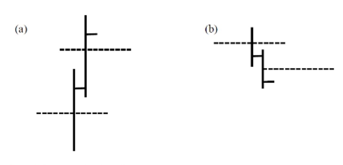
Figure (xvii) Formation of a firm pattern
Some patterns will run according to basic theories, but some not. Why is this, you ask? Simply because some patterns are quite firm and others not firm enough, so you may change to other patterns halfway – breaking the original pattern. This means that the triangle is no more a triangle. Therefore, the investor’s original plan has to change. But, how can you tell this from that? Simple, we have to aim at the beginning of a triangle. Figure (xvii) shows two forms, (a) is the beginning of an uptrend which is shown in a bar chart of HLC. On the first few bars of an Ascending Triangle, the closing price should be on the upper half of the bar and the middle is shown using a dotted line. The Big Shot intends to do the collection, so prices will be bought up by them before the end of the day, meaning they will have achieved a good harvest and collected enough stock during that day. As for the following day, the low should not be lower than the previous day. The whole bar is higher than the previous bar, continuing to soar up, with the closing price also being above the middle-dotted line. When reaching a certain level, it starts to go down, but bear in mind that the closing price should be on the lower half of the bar this time, and the following day the high should not be higher than the previous. One more crucial point is that the bar in a downtrend should be shorter than that of an uptrend, for the aim of the Big Shot is to buy up the product so that buying power is stronger, and in a downtrend their aim is not to make the price collapse, but just buy again at a lower level. Therefore, the depth and strength of the trend will not be great. These are the main points of distinguishing a firm pattern. When it is firm enough, we can invest more and have more patience, or it is best to change to another stock or even another market.
b) Descending Triangle
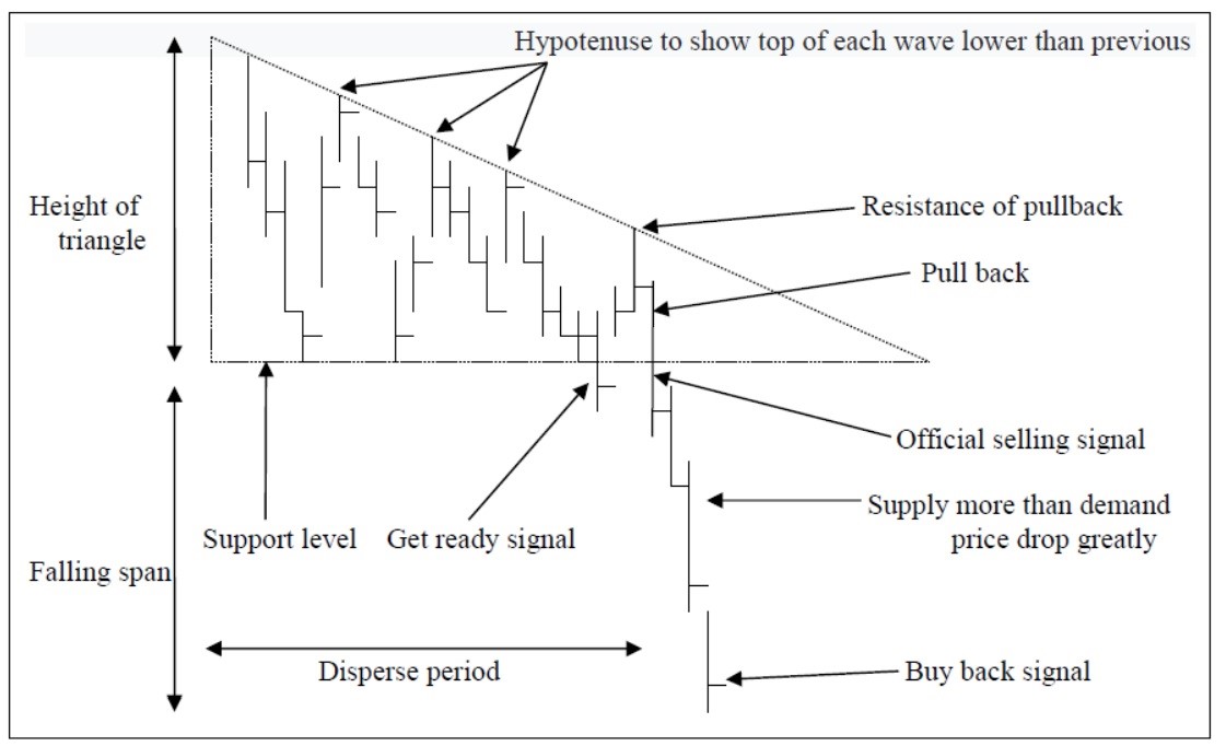
Figure (xviii) Basic theory of Descending Triangle
The Descending Triangle is actually the reverse of the Ascending Triangle. The simplify it, if a Big Shot wishes to release a large number of products but is afraid that too much selling could push down the price, Formula Selling can be used to buy up the price a little when it is pressed down a lot. Their aim is not to buy up the price but just to re-sell at a higher price, therefore the high of each wave will be lower than the previous and thus forms the Hypotenuse of the triangle. After a series of selling, the supply in the market is greater than the demand; this drives the price down to penetrate the bottom line. The sellers who sell earlier will take profit and buy up the price to form a pullback or drawback to digest the selling orders. When all buyers are kicked out of the market, the product has to drop. The span of profit taking is also the height of the triangle shown in figure (xviii).
As for past trends, please refer to the Ascending Triangle. We just make a reverse and point out that trend (1), (2) and (3) are used to forecast the reverse trend and will be more useful, but trend (4) and (5) are already in a falling trend, so regardless of whether it is accurate it is not as important as the reverse trend.
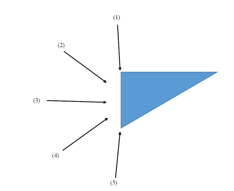
Figure (xix) Past trend of Descending Triangle
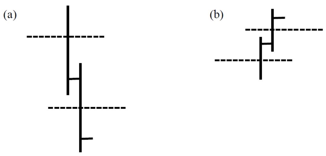
Figure (xx) Formation of a firm pattern
As for the formation of Descending Triangle, it is just the reverse of the Ascending Triangle. When it first drops, it should start with a bar, which is close at the lower half, and the following day the high should be not higher than the previous high. When it rebounds, the bars should be shorter for the formula selling, but you still want to sell the product and not buy up, even if the closing price is in the upper half. The standard period of formation is also 3 months for most of the patterns.
c) Variants of Triangles
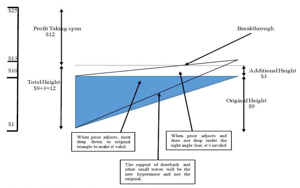
Figure (xxi) Variants of Ascending Triangle
In the practical battlefield of the market, few Ascending Triangle patterns will come out in a standard shape of a right-angle triangle with a 100% horizontal line and 100% vertical line. Sometimes, when the buyer’s power is stronger, it creates an upward variant as in figure (xxi). In such a case, the additional height will be generated, and this is the additional profit taking level which should be added to the original height. It is important to bear in mind the adjustment though – the price should fall into the original right-angle triangle or else it is invalid and may be a trap. The support of a small wave or drawback will be at the new Hypotenuse. The profit-making span should be the height of the triangle ($9) plus the additional height ($3), so at the level of breaking through ($13), just add the span ($12). The profit taking level is at $25, which means that you should leave at this level no matter the at which you enter the market.
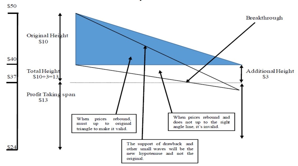
Figure (xxii) Variants of the Descending Triangle
The variant of a Descending Triangle is just the opposite of the Ascending Triangle, using the additional height ($3) and adding it to the original height ($10) making a total height of $13, that means the price will drop from $37 to $24 and therefore the profit taking level is at $24 no matter at which level the investor entered the market.
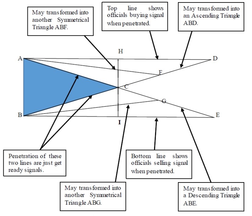
Figure (xxi) Variants of Symmetric Triangle
Normally people ask among which of these many patterns one is the best or most accurate. If investors want to know which is the most accurate, they should start by learning the more inaccurate Symmetric Triangle. This is inaccurate not because of the pattern itself, but because the readers are in too much of a hurry to make the decision.
Traditionally, the Ascending Triangle shows a trend that will rise soon, and a Descending Triangle represents a falling trend on the horizon, however, a Symmetric Triangle is directionless. Most of the time it will further develop into other patterns. The basic theory of a Symmetric Triangle (ABC) is that the price can penetrate from either side. If it penetrates from the upper side (AC), it is a buying signal, but it is a selling signal if it penetrates from the lower side (BC). Then the Triangle (AB) height is the span of profit that can be relished no matter whether buying or selling. But the problem arises when penetration occurs in the upper side (AC). Normally the previous high is considered as a resistance (point A) and it is too near and has no room for reaction. Suppose it reaches point A and turns back. In that case, it is very likely to transform into another pattern – an Ascending Triangle ABD – but before forming the ABD when midway, it can also form another Symmetric Triangle known as ABF. As for the lower side of BC, it can also transform to a Descending Triangle known as ABE and in midway it can also form a new Symmetric Triangle of ABG.
The major problem is that all trend lines are drawn manually in the chart, whereas in a live market, the price does not follow exactly what is drawn. A Symmetric Triangle tells us that market velocity is diminishing. This means the ups and downs are quite great at the beginning but become smaller. However, this does not mean that it will follow the trend line of AC or BC – in fact it would go out of the triangle ABC at the end of line HI to form new patterns such as ABF, ABG, ABD, and ABE. It is not accurate because we do not know what kind of form it is going to transfer to. It is often known as a midway pattern and we still need to observe what the next stop will be.
However, no patterns can exist alone, all patterns should link up with a practical market situation.
Low and Behold! In the next Allocution, we will talk about the most accurate pattern.