
Key summary:
As a rule, Investors normally ask which of the many patterns is the most accurate? The answer – Head & Shoulders is widely accepted as the most indicative pattern. A lot of corporate traders follow this pattern in practical trading. However, most accurate does not mean 100% due to two reasons. First of all it must link up with the international situation, and secondly it also has a lot of variants just like the triangles in the last Allocution. Regardless, let’s look deeply into the formation first.
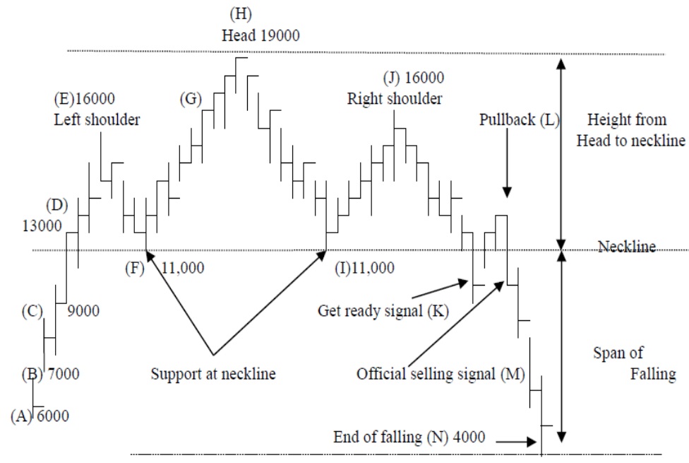
Figure (i) Basic Theory of Head & Shoulders
a) Formation
The formation of a Head & Shoulders is different from previous triangles; an Ascending denotes a Big Shot is in the collection phase, while a Descending Triangle indicates that a Big Shot in the distribution phase. However, Head & Shoulders indicates that several Big Shots are struggling against each other, sometimes in headwind and sometimes in tailwind. Buyers and Sellers have equal power and not as in Ascending Triangle where the Buyer dominates and Descending Triangle where the Seller dominates. After a series of struggles the Seller wins in this pattern.
Let’s take a deeper understanding of the market behavior of the Head & Shoulders. Take the example of Hong Kong. Figure (i) shows how a Head & Shoulders pattern is formed. When the market is stagnant and the Hang Seng Index is at a low level, few investors will want to enter the market. Point (A) denotes this situation where the Index may be as low as 6,000 points. However, there will be a group of ‘internal industry buyers’; those who can capture the best and cheapest when faced with many different products. This means that if someone works at a carpet company for example, the carpet at their home should be beautiful, durable and cheaper than others, or if someone works in a kitchen utensils company, their own kitchen should be modern and achieved at a lower cost too. This is because these buyers are facing the same market every day and every hour, so that they can easily detect the chance to buy the best product at the best time and the best price. They don’t waste time studying or researching the product, they know exactly what they’re looking for. This is applicable to every kind of industry and market. So even if the Hang Seng Index is as low as 6,000 points, even if no foreign or local investors want to enter at such a stagnant market, and even if there’s no attraction for big buyers, there will still be a group of internal industry buyers who will do transactions every now and then.
Even if the market is sluggish, they can make a slight profit based on their experience and their ability to seek out opportunity easily and quickly compared to others. If they make a slight profit they will re-invest and go out for consumption. Re-investment means the market will go up a little because of capital injection and outside consumption will also bloom the general market. Others may then follow suit when they see the success of these finance people, who appear wealthy and have funds for shopping and travelling. When new capital is injected the market will go up, but only slightly to point (B), which is 7,000 points.
b) Hot Money
In regional investment there is a term called ‘Hot Money’. This describes a portion of capital ready for immediate investment. For example, at the beginning of the year each fund manager will allocate a certain amount of money for investment, and divide it into several portions, for example 20% on currency, 20% on gold, 20% on US stocks, 20% on commodities, and the final 20% will be kept as Hot Money. That means that there will be no definite target at first, and they will just wait and see which area is the hottest, or which market rises most before rushing to invest their Hot Money in that market. When a certain amount of profit is made, they withdraw from that market and re-invest into another market. The portion of money keeps on rotating in the medium to long-term. This is why the Head & Shoulders pattern is different from other patterns considered the most accurate pattern – all because of Hot Money!
When those with Hot Money realize that the Hong Kong market is rising they may look to transfer their capital here. Those may be Asian countries like Singapore, Japan and Taiwan. The capital injected thus is usually more than local investors since they are from different places, and thus the price is further inflated up to 9,000 points on the Hang Seng Index, which is point C. This is a prominent rise of 2,000 points compared with the local internal industry traders which inflate the rate by 1,000 points, meaning investor with Hot Money who are from further afield, such as Europe, may be tempted to invest their money here.
Normally, capital invested locally is smaller than that from further away. From point C to point D 13,000 points, the rise will be larger. Point (C) denotes capital from nearby places like East and South East Asia, Point (D) shows capital from locations further afar like Europe or Middle East. The countries further away normally bring larger capital. At first, they may start with smaller capital invested locally, but when they see that money in locations further afield is rising, they may choose to invest their capital there, and the amount will usually be greater. Point (C) may be an attraction of own region, and point (D) would be another region. So, it surely has some differences? Firstly, the index will rise more than usual, let’s say 6,000 points to 16,000 and when pushing up to point (E), it no longer attracts capital only, but also buyers to become sellers. This point (E) is called the first shoulder or left shoulder.
The basic theory is that no market will rise forever and surely there will be a point of adjustment. The depth of adjustment and the level to which it could raise to, will be discussed further in the Allocution of Wave Theory. But at Point (E), there are two groups of people, besides sellers that have already bought at the low, there’s a further group; potential buyers. These buyers may have been observing the Hang Seng Index and seen it rise for quite a long time and may have wanted to enter but might consider it too high already, and certainly too risky. They want to buy in order to control the risk, so they will wait for an adjustment or they may decide to implement short selling to speed up the adjustment. In major financial centers of the world short selling is legal, however, this can be limited to certain stocks. This is why short selling can facilitate the fall of the index.
When reaching the level of point (F) 11,000 of Wave Theory, we can see that this forms the left shoulder of Head & Shoulders. It denotes the struggle of Buyers and Sellers. From Point (A) to Point (E), buyers win, but from Point (E) to Point (F), the victory is all with the sellers.
When the price drops from (E), short sellers of course earn a lot of profit, similar to the buyers at low of (A),(B),(C) who may have taken profit between (A) to (E) if they haven’t missed their chance. Therefore, when the market falls from (E) to (F), buyers who missed their chance to take profit may rush to sell and make the market falls faster. On the other hand, those who have already taken profit can buy again when the prices become cheaper; making it a fierce struggle between buyers and sellers. This is different from the previous triangle patterns where a Big Shot dominates while others are subordinates.
Point (F) is another attractive point, where buyers from as far as North America travel over, bringing more capital. There are two groups of buyers, both coming in at different times. Some have been waiting for adjustment at point (D) and some at point (F), and when it reaches the target level, they will buy in large amounts for they have been waiting for quite a long time. However, not everyone’s calculation in the market is accurate. Some will miss the chance because they’ll be waiting for the price to go down further but it won’t go. As the market soars up, they’ll therefore take the previous high as resistance, which is point (E). But when going up above this level, it is breaking the record high and the market sentiment will be more furious and everyone – old or young – is desperate to enter the market at all costs. Regardless whether they’re local or from aboard, all capital will flow into this market and continue to push it to its peak of point (H).
After all capital has entered the market, further capital cannot push drive it further up and the only direction it can now go in, is down. The price then returns to its previous low which is Point (I) at 11,000. At this level buyers again enter the market for it is already proven that this is a point of support, not just by forecast but by market action of point (F). Everyone may have thought this is the lowest price for buying and the market could not go under this price level. It had been proven at point (F) which is 11,000 points and when point (I) reaches the same level of 11,000 points buyers re-enter to have another go at struggling. So, it will go up to point (J), which is not necessarily at the same level of point (E), sometimes it can be higher and sometimes lower. When it goes to point (K), it we are then at the ‘get ready signal’, that means investors should keep a close eye on the market. If an investor checks the price three or four times a day, when this signal comes, they could double, triple or quadruple their investment. As for the pullback (L), official selling signal (M) and span of falling (N), it the same as the Ascending and Descending Triangles. But some clever investors may raise a question.
c) Pullback
For every pattern it’s the same, sometimes there is a pullback but sometimes there isn’t, so when there is a breakthrough, how do you distinguish whether it’s a get ready signal or an official signal? The simple answer is, by the volume of trading. If the volume increases greatly, than it is a genuine selling signal, but if it increases only slightly it may just be a get ready signal or even a trap. This is especially important in the stock market compared to currency or gold markets. Furthermore, no clear definition can be given on what is meant by great or slight this time, so experience and different market situations now come into play.
The official selling point is at (M), the level of just under 11,000 points. Can an investor sell at (J) which is 16,000 points, so as to get an extra profit of 5,000 points? The answer is absolutely not! For when at point (J), there’s still a chance it will go further up, transform into another pattern, or turn into a variant of double, triple or quadruple shoulders. Regardless of patterns, an investor should wait for the official selling or buying signals. When selling is completed at point (J), it should be treated as a short-term order and the investor should buy back before it reaches the neckline.
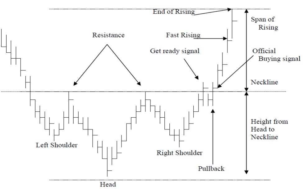
Figure (ii) Reverse Head & Shoulders
Reverse Head & Shoulders is sometimes known as Inverse Head & Shoulders, Inverted Head and Shoulders or Head & Shoulders Bottom. Basically, it is the inverted pattern of the traditional Head & Shoulders. It shows the struggle between sellers and buyers for 3 rounds. For the first round, sellers win and then buyers come in to form the left shoulder. The second round is most furious – sellers win greatly and then buyers have a stronger counterattack and thus forms the head. The final round of attack and counterattack forms the right shoulder. Normally, after the official buying signal is revealed, there will be a period of fast rising to reach the target. The rest is basically the same as the traditional Head & Shoulders. However, for variants there needs to be further explanations in comparison to the Triangles previous mentioned.
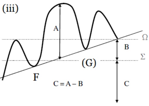 Figure (iii) Clinging upward variant | 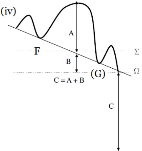 Figure (iv) Clinging downward variant |
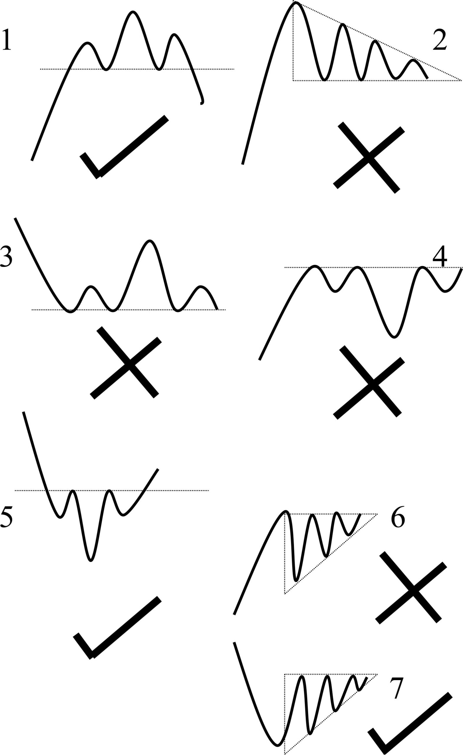
Practically, variants appear much more often on the chart than standard patterns or can be said in the ratio of 1 to 99. Let’s go on the basic theory first. In Figure (iii), it is a variant of clinging upward, we have to fix the height which is from the top of the head to neckline and is known as “A”. The original neckline is at “Σ”, the breakthrough is at “Ω”. So, when we want to calculate the span of the fall we have to find out the difference between traditional pattern and this variant first. That is Ω – Σ = B and the span of falling is C = A – B
In figure (iv), it’s a pattern of clinging downward, should the difference be unchanged, that is the value of B kept unchanged, this time we need not to minus but to add on the additional difference to the height which is C = A + B
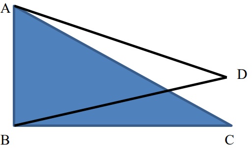 Figure (v) Comparison to Descending Triangle | 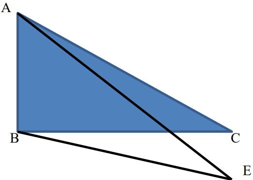 Figure (vi) Comparison to Triangle variant |
So, when comparing the Descending Triangle in Figure (v), ABC is the standard triangle, but when clinging upward, it has already transformed into a Symmetric Triangle, so there is no need to minus the difference, but rathe observe it as a Symmetric Triangle. But in Figure (vi), it is a variant of the clinging downward triangle and we have to add on the difference as in the Head & Shoulders. When based upon the theory of the Symmetric Triangle, we can conclude the Figure (iv) the clinging downward Head & Shoulders is more accurate, and in Figure (iii), it is not so accurate simply because it will meet with the support of previous lows soon, witnessed at (F) and (G). However, in Figure (iv), it is already lower than the support of (F) and (G) and will never be hindered when it drops. Therefore, the variant of clinging downward is more reliable or accurate, witnessed in Figure (iv), while Figure (iii) may be a trap or at least not so reliable.
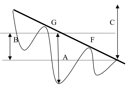 Figure (vii) Downward variant | 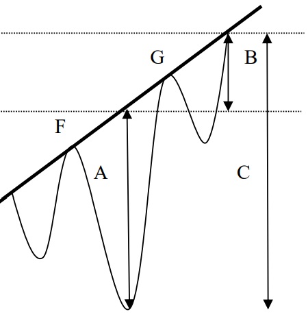 Figure (viii) Upward variant |
As for Variants of Inverted Head & Shoulders, just view them upside down. Figure (vii) shows a downward pattern, so when penetration occurs there is resistance at points (F) and (G), thus the speed is lower and the route is harder. At the resistance point if something special happens in the market this can have a strong impact and may change the patterns into something else. Also, the span of rising has to deduct the difference from a standard triangle to this variant which is (B), therefore C = A – B. But in Figure (viii), just add on the difference (B), that is C = A + B.
 Figure (ix) Comparison downward |  Figure (x) Comparison Upward |
So as for the Ascending Triangle, in Figure (ix), it is clinging downward and therefore already transformed into a Symmetric Triangle. This isn’t very reliable for there are too many obstacles in the middle and it may be even a trap. However, in Figure (x), its more reliable and profitable for the obstacles are removed.
Even though the Head & Shoulders is considered the most accurate of the patterns, some are more reliable and some are less reliable depending on the variants and therefore it’s important to consider the past trends thoroughly as shown underneath.
1) Past Trends of Head & Shoulders
Figure (xi) Past Trends of Head & Shoulders
Basically, the past trends of the Head & Shoulders can be summed up in 5 directions.
2) Past Trends of Inverted Head & Shoulders
Figure (xii) Past Trends of Inverted Head & Shoulders
The past trends of the Inverted Head & Shoulders can be summed up in 5 directions.
The greatest function of chart analysis is to find out the reverse trend, so if the past trend is different from the forecast trend it is very useful, but if in the same direction, it’s useless and may be a trap.
3) Multi Shoulder Pattern
 Figure (xiii) Double Left Shoulders |  Figure (xiv) Double Right Shoulders |
There are still some additions to variants of the Head & Shoulders patterns aside from clinging upwards and downwards. There can be more than a pair of shoulders, sometimes there is a Double Left Shoulder as in Figure (xiii) and sometimes a Double Right Shoulder as in Figure (xiv). On the whole, the appearance of a Double Right Shoulder is more than Double Left Shoulder for after a fierce struggle of the Head, still those who have survived will fight until the very end. Thus, there will be further additions as followings.
 Figure (xv) Multi Right shoulders |  Figure (xvi) False Penetration |
Multi shoulders normally happen in the Right Shoulder as shown in Figure (xv),but beware that such a pattern can easily develop into False Penetration as shown in Figure (xvi). We have to mind the market velocity, the technical indicators which will be discussed further in the Allocutions hereafter, as well as the volume. An easier point is to mind the length of period. Generally, for every pattern, the period needed to develop into a mature pattern, or a genuine pattern is three months, but could be as short as two months, which is also acceptable. However, for Head & Shoulders it’s better to stick to three months for it denotes a series of struggling between buyers and sellers and not just a single Big Shot doing the collection or distribution. When the period is too short or too long, it may have other variants, transform into other patterns, or just simply be a trap.
Besides the most accurate or non-accurate pattern, we also have the most commonly used pattern which is the Channel. This pattern appears nearly in every chart and every case, whether it is accurate or not depends on the user. When wrongly used, the investor can easily become a misguided martyr, however, when properly used, the investor can be the hermit high upon the mountain guiding others. Let’s look at the basic theory first.
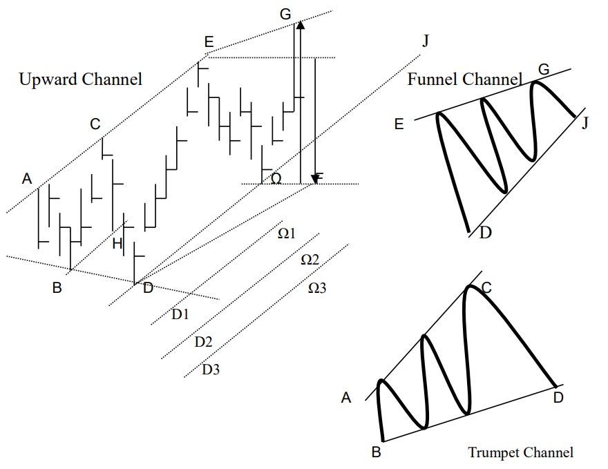
Figure (xvii) Different kinds of Channel
The Channel can be divided into Upward Channel (Uptrend Channel) and Downward Channel (Downtrend Channel). After a series of training, the writer believes investors can stand on their own and skip off the opposite pattern. We will only talk about the Upward Channel and investors can use their imagination to understand the Downward Channel.
1) Basic Channel
The basic theory is that if the investor draws two parallel lines on the prices, one on the top and another on the bottom, they will find when the price hits the top line it will turn down, and when it hits the bottom line, it will go up. On the whole, the highs are higher than before, and lows are higher than previously; this is a standard Upward Channel. When referring to the past it is quite easy to draw such lines for all prices which are fixed and will not change, whilst it’s harder is to plot the future trend. The main function of chart analysis is to forecast the future; thus, we have to understand it step-by-step. There are many problems which may be encountered such as the fact that a standard pattern is just one out of a million, while most of them are variants.
In the beginning of the channel, we do not know what pattern it is going to develop. If we can plot two lines which are AC as an upper line and BH as a lower line, then the initial pattern is formed. However, these lines are drawn by individual investors inside their computer, and the market outside will not necessarily go according to a single investor’s computer. If they really go with the plotted line, it quite nice, but most of the time it’s not. If we only have two points, we cannot plot the channel, we need at least 4 points to fix it, but sometimes it’s too late and we have to use 3 points to fix it. For the AC and BH channel, if it is fixed, sometimes it may not go further as would be expected, so we have to try to fix it at 3 points. That is when we have ABC 3 points, and we have to forecast the fourth point. It is very hard to do so, if the sixth sense of the investor is strong, they will not need to learn chart analysis. Therefore, writer assumes that all of us are weak or do not have any sixth sense and must therefore avoid misguiding forecasts.
2) Guiding & Misguiding forecasts
This time the investor is rushing and plots the channel lines as AC and BH, when they’re actually not; so, after the BH line is plotted, the price continues to drop. What happens when it stops at D? We can plot two lines which are AC and BD to form the Trumpet Channel as shown in the right lower pattern. Of course, the trumpet is not as accurate as the parallel lines of a standard Upward Channel. As time goes by, we may found the trumpet may be an intermediate pattern and may transform into another pattern which is the Standard Upward Channel of AE as upper line and DΩ as lower line.
Besides using the above method, another method is where you use 4 points to draw a Channel, that is to use 3 points on top and 1 point at bottom to be parallel with the top line, which means ACE is the top line and DΩ is the lower line. For when 4 points are plotted, the 5th point sometimes is very accurate and sometimes not. Thus, we have to try. However, for investors or students who are beginners, they may face a common mistake at this pattern, that is misguided by the trend line drawn. That is when the price continues to drop, the investor may plot a new trend line as a support line which is D1Ω1, and if it further drops, some may plot another new trend line which is D2Ω2, thinking that it may stop the drop, but unluckily, the market continues to fall and another new line needs to be plotted, which is D3Ω3, which then continues to D∞Ω∞.
You may ask why the writer uses the Greek alphabet as opposed to the English? This is to show point Ω is different from other points, it is just an imaginary point at the stage of ACD, we only have 3 points, but we use point D to plot a parallel line to AC, hoping the prices will reach point Ω when dropping from point C. But this is an imaginary point only, hoping it is really the Ω (Omega, the last). Unluckily, when the prices keeps on falling, the investor may plot more lines underneath hoping to stop the fall, but the market will still go down. The market does not stop because someone is drawing a resistance inside their computer.
Now please refer to the Head & Shoulders Pattern, (III) Pullback, point (J), as this is why the writer says you should not sell at this point. Actually, not everyone would do so in the Head & Shoulders Pattern, but in this Upward Channel a lot of people may plot several lines like this. Actually, the pattern shouldn’t misguide investors, it’s the investor who misguides themselves. However, a smart investor cannot be misguided and will act as a hermit to guide others.
3) Standard & Variant
Let’s talk about the standard pattern first. If the price really goes within the Channel, you’d buy when it touches the lower line and sell when it reaches the upper line. This is different from other patterns, as nearly all patterns need a buying or selling signal on breaking through to do the trading, but this pattern does not need that and that’s why some investors are misguided. Actually, the trading method of the Channel Pattern is Double-Double folded, that is quadruple, while other patterns only give one signal, either to buy or sell. When the prices reach the top and bottom of the Channel you can buy and sell, but when breaking through upward or downward, there are also signals, and normally breaking through signals are a stronger indication than the line buying or selling signals. Altogether four signals can be generated.
So, when the price goes down from E to Ω, there are two parallel lines known as AE and DΩ, if the price is having a breakthrough then it is considered as a selling signal, and the span of falling will be the height from E to Ω. This is the vertical height as shown in the arrow, and not the bearing length. There are two different lengths and if the price rebounds, sometimes, it may not go up to the parallel line but be lower, which is point G, thus forming the pattern of the Funnel Channel where EG is the upper line and DΩJ (in left hand side) it the lower line as shown in the upper right pattern EG + DJ on the upper right hand side pattern. In such a case, when the breakthrough occurs on the upper side, it is a buying signal, and to measure the span of profit taking you should use the vertical height from Ω to G.
There is also another variant which can be seen in AE as upper line and DF as lower line or EG as upper line and DF as lower line. Actually, there are still many variants that can be envisaged. The most special point of the Upward Channel is that it has 4 points to do the trading. So, when there’s a reverse, the investors and readers can use their imagination to understand the Downward Channel which is just the opposite.

Figure (xviii) Double Bottom
Double Bottom is also known as W-Shape, the reverse pattern is known as Double Top or M-Shape. Anyway, these two sets of patterns which are widely used and at the same time generate a lot of misunderstanding which needs to be clarified.
Now investors can easily understand that the support is on the baseline AC and resistance is on the topline BD. As a matter of fact, such a standard pattern seldom occurs, most of them are variants. These form the bottoms of the W-Shape and are not always exactly equal to one another; the second bottom is always slightly higher or lower than the previous, and misunderstanding occurs here. The word “Bottom” may misdirect the attention of people to the bottom, thinking that when reaching the bottom everything is done. Some may start buying here. Oh no, this is actually a high-risk area and the buying signal does not occur here! It will be shown on breaking through the topline. There will be a Get Ready Signal when it goes up above point D and a pullback in F and Official Buying Signal at H. The height of the W-Shape is the span of profit taking, all of these are the same as previous patterns. But…
Shall we start from Point A? When it goes up to Point B and turns downwards, investors should aim at the bottom point which is C, but the market may not go straight down or up, when it turns up at point G, a lot of people may start buying at G, but it will still go down to point D, or even D1, D2, D3 or D∞ as stated in the previous Channel Pattern. The official Buying Signal is at H. Besides the D point, the way from C to H is not necessarily smooth and straight, sometimes it may have a drop in midway like Point J and mislead investors in order to go further down to K. To solve this problem, we have to go to the intraday chart such as 60 minute or 30-minute chart if investors want to do short-term trading or turn to the technical indicators which will be discussed in further Allocutions.
2) Variants of Double Bottom
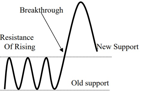 Figure (xix) New Support | 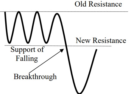 Figure (xx) New Resistance |
For variants of Double Bottom or Double Top, it is very easy to develop into horizontal platform as said in the multi shoulder of Head & Shoulders Pattern. Beware that in Figure (xix) when a breakthrough occurs, the original resistance will become the new support. That is when the price goes up above the resistance line and have an adjustment will stop at the original resistance which will be known as the new support. In Figure (xx), when the price is having a breakthrough and penetrating down the support level it rebounds and the resistance level will go down to the support level, now known as the new resistance. Further details will be talked about in the Allocution of Wave Theory.
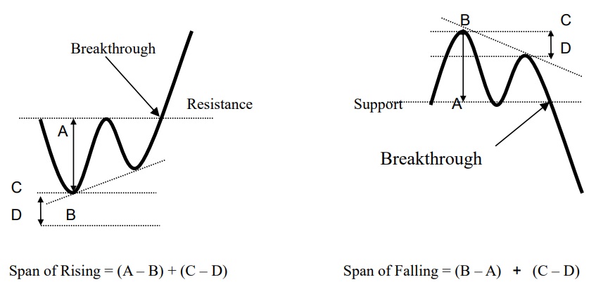
Figure (xxi) Measuring spans of rising and falling
So, for the profit taking level, the measurement is the same as other previous patterns. When the W-Shape is clinging upward, we use the height of the pattern to add the level of upward cling as on the left-hand side of Figure (xxi), but when it is clinging downwards it is not as reliable for it may transform into a Symmetric Triangle or other patterns.
When it is clinging downwards in an M-shape as shown in right-hand side of Figure (xxi), we just add on the difference of clinging downward, but if it is clinging upward, it is not reliable for it may transform into a Symmetric Triangle or other patterns.
The rest of the M-shape should be just the opposite of the W-shape, and investors should use their own imagination to understand this further.
3) Past Trends of Double Bottom
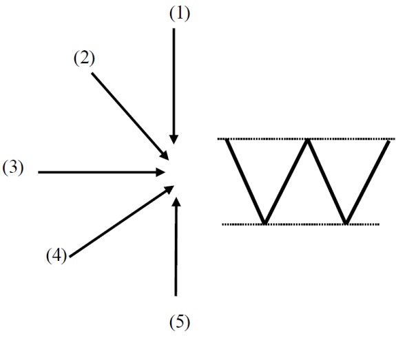
Figure (xxii) Past Trends of Double Bottom
The past trends of the Double Bottom can be summed up in 5 directions.
4) Past Trends of Double Top
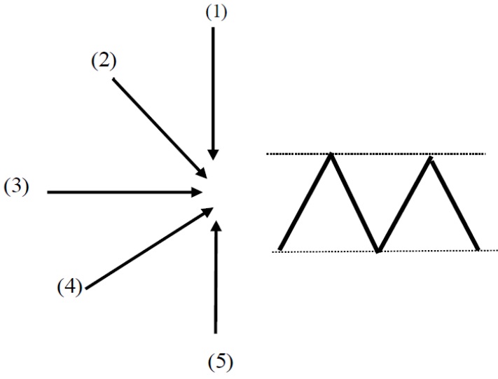
Figure (xxiii) Past Trends of Double Top
Basically, the past trends of the Double Top can be summed up in 5 directions.
The rest of M-shape should be just the opposite of W-shape, so investors should just reverse what’s been discussed in order to understand this.
Basically, chart patterns can be applied to different markets including currency, gold, commodities, and the stock markets. However, there is an exception and that is the Round Bottom or Curved Bottom and Round Top or Curved Top. This pattern normally is applicable to currency or gold markets, or markets have a 24-hour trading period. When applied to stock market, because it has a clear opening and closing time, it not so accurate. For there is a clear interval between the closing of today and opening of tomorrow. However, the Local London Gold is trading outside the exchange house without opening and closing time, and the spot currency is on the same pattern.
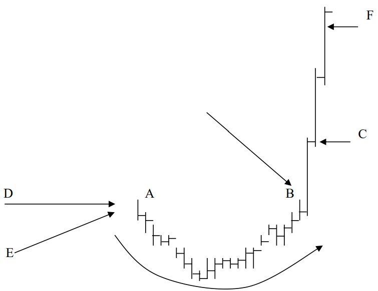
Figure (xxiv) Round Bottom
Normally, chart patterns have a clear breaking through point, but this pattern does not have a clear cut. It simply needs a sluggish and small range past trend, like D is going horizontally, and E slightly upward. You cannot apply the opposite direction of past trends as in Head & Shoulder, Triangle or W-Shape and M-Shape patterns. When the range narrows and slightly drops then this pattern starts to develop at A. Actually, the pattern could not be round and the curve is an imaginary line only. When it curves up to B, it is a Get Ready Signal. When investors get up in the morning and find it shoots up sharply, then it is a Buying Signal. But at point C it’s still important to be mindful that the price cannot go down; if it goes down then it is a false signal. When it continues to go up, buy immediately. The height of the first bar is the span of profit taking, just add on the closing price. So, on the third morning, if it continues to rise, it’s too risky to chase. For this pattern sometimes is also known as Two Bars, and it’s common for the trend to be completed on the second bar Even though sometimes it may go further to the third or even fourth bar, but this poses a higher risk, for it can turn back abruptly. Chart analysis helps to establish the suitable point to enter and leave the market. After this you can divert attention away to another product or another market, as there’s no need to linger when the span of profit taking is completed.
In order to identify the true patterns from the false, we must understand the condition under which it is formed.
1. This is a standard Head & Shoulders Pattern denoting the struggles of buyers and sellers, normally it is done under furious market conditions and will break a number of record highs meaning the accuracy is quite high.
2. On average, the accuracy of the Descending Triangle is lower than the Ascending Triangle provided that both are standard triangles. This is because it is at the upper level of the market, where the battle is ferocious and there may not be time for the Big Shot to carry out their plan of distribution which may be interrupted. So, in such a case, the Head & Shoulders is more reliable.
3. When the market goes down from its high, this means it is cooling down for both buyers and sellers, so there may not be any struggles. However, Head & Shoulders is only for when there is struggling, if there are no struggles, it does not work. So, such a case of cooling down may mean the Descending Triangle is more accurate, and it would work if the market is not so ferocious, then the Big Shot may have more time and room to carry out their plan.
4. When the price rises from the low and forms an Inverted Head & Shoulders, most of the time this is a trap. The greatest function of Head & Shoulders is to forecast the turning point and if there is no turning point then there is no need to forecast anymore. If it carries on in the same direction, there are other methods which we’ll discuss later.
5. Inverted Head & Shoulders when appears it after a big slump, or if it moves slowly over a long period, is the most accurate, for it shows the oversold struggle at the low.
6. When the market has gone up a long way and we witness the Ascending Triangle, the accuracy is quite low. For the Ascending Triangle records the action of collection at the low and will push up higher and higher. The Big Shot will not buy at this high and has no time and room to exercise Formula Buying according to their own plan.
7. When the market is sluggish or going down, the Ascending Triangle is most accurate
There are still a lot of chart patterns and applications which will be discussed in the Allocutions which follow.
To learn the basic theory is not so hard, but application is the hardest. Anyway, no chart pattern can stand alone, they are all inter-related. Any pattern may transform into another pattern. Above all, patterns cannot be cut off from the secular world, everything happening under the sun can affect the breakthrough, pullback, highs and lows of each chart. All political and economic reasons cannot be seen in the chart. So, for a smart chart analyst, their eyes are looking at four sides and ears listening to eight directions. A chart is in hand, but the whole universe is inside the chart.