
Key summary:
Besides Technical Indicators in Allocution 8, Economic Indicators are also widely used by investors. Basically, those are a group of figures compiled by different departments and announced on predesignated days. There are a lot of indicators reflecting different situations of the society. To sum up, the most popular indicators concerned are Employment Report (Non-Farm Payroll and Unemployment), Initial Claims and Continuous Claims, GDP, Trade Balance, Inflation (CPI), Consumer sentiment, Small Non-Farm (ADP)……etc
Different times would have different emphasis on various indicators according to the society needs. During the economic bloom of 1980-2000, Trade Balance was the most important factor of the market where each minute can cause turmoil of the market for several hundred base points or even thousands. However, after the 9-11 terror attack, there was a recession. Focus has been changed from Trade Balance to Employment report. That is the loss of job and creation of job became the focus. Trade Balance basically still important, but the focus shifted to creation of job while doing the trading. Intellectual property was also the focus, but when it is stolen, the outcome is on loss of jobs rather than the invisible loss of copyright. The Financial Tsunami of 2008 brought about a recession, how it is measured? By loss of jobs. How was it recovered, but creation of jobs?
As for the lockdown of Covid-19, the world was in a recession, it is also measured by loss of jobs, and recovery is also measured by creation of jobs. When inflation comes, the US Fed has to start Tapering, it is also measured by jobs, and everything is jobs, jobs, jobs. This trend has lasted since early this century and will carry on for decades. So let’s start review of the following Economic Indicators one by one.
Normally, the employment report is released on the first Friday of a month, but not necessarily the same every time. When the 1st day of a month is on Friday, they would postpone it to the 8th day so as to prepare it well. Normally, the report is divided into several sectors: Non-Farm Payroll, Unemployment, Average hourly earnings, Average Weekly Hours, Manufacturing Payrolls, Government Payrolls, Labor Force Participation Rate, and Non-Farm Payrolls Private. Out of these, the Non-Farm Payroll is considered as a 5-star indicator, while Unemployment 4 and a half start and others 3 stars only. Original data can be found easily from the following website. U.S. Bureau of Labor Statistics (bls.gov)
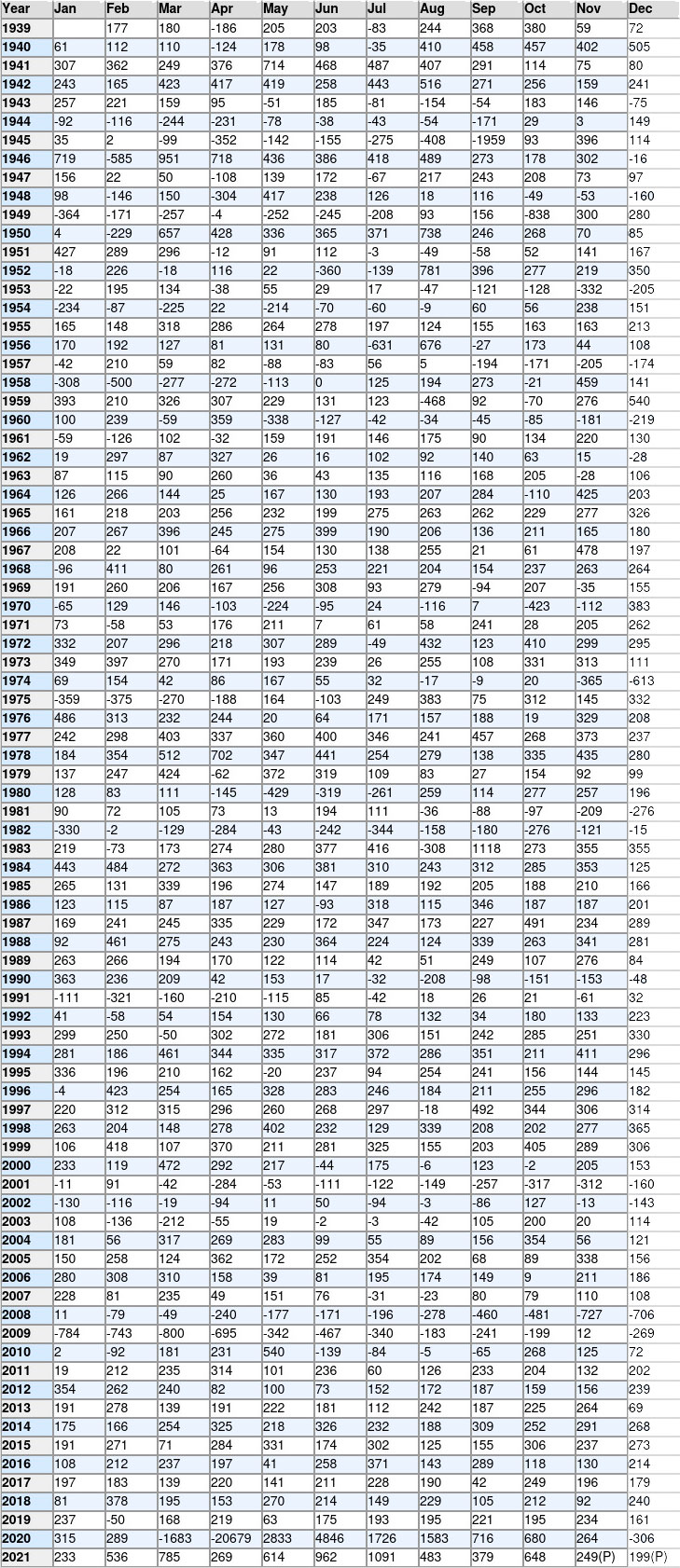
The name of this indicator is a little different from its function and effect where a lot of people neglected. When you consult an investment dictionary, they will tell you payroll is concerning the salary received by people. However, from the attached Table (a), what investors can see is not such a figure, but the number of jobs created or added to the economy.
In the financial market, there is a saying. “When everyone is wrong, that is correct!”
Practically, everyone knows that Non-Farm Payroll cannot tell you how many people are there in the workforce receiving how much salary. Instead what it really shows is the jobs that had added or deducted from the economy.
Analysts use such figures to forecast the economy of the society, and plan for the policies needed. Let’s see how it works. People say the Financial Tsunami in 2008, US had a loss of 8 million jobs, how is it calculated? Actually, it came out time by time and not in a single day drop.
1) Loss of jobs
The petroleum price rose to US$147 in 2007 and thus brought about the subprime mortgage crisis, and in early 2008 there was a recession. Some said it should be start counting from Feb 2008. The attached figure is shown in thousands. In Feb it is -79 which means the job lost is 79K from the society. However, this calculation would come to a sum of 9 million job lost. Most of the people starting counting from Sep 2008 on the bankruptcy of Lehman Brothers, so we just add on all negative figures from Sep 2008 and the last negative figure is Sep 2010 and thus we came to a total loss of job like this in Table (a).
460 + 481 + 727 + 706 + 784 + 743 + 800 + 695 + 342 + 467 + 340 + 183 + 241 + 199 + 269 + 92 +139 + 84 + 5 + 65 = 7,822K
Therefore people said the total job lost is nearly 8 million. Don’t misunderstand that on the bankruptcy of Lehman Brothers, it immediate made the society lost 8 million jobs in a single day or month. It is impossible! The loss of jobs has gone through a period of time for two years.
2) Recovery
So how about the recovery? The Fed launched out the QE policies and White House passed the Bill of ARRA to stimulate the economy. When recover is done, they withdrawn the QE policies, so how it is defined as total recovery. That is by gaining back the loss of jobs, and then the mission is completed. So let’s start calculation from Nov 2009, this day will be further explicated under the item of Unemployment. We just add all positive figures together with effective from Nov 2009 to Dec 2013. We come to a sum like this again in Table (a)
12 + 2 + 181 + 231 +540 + 268 +125 + 72 + 19 + 212 + 235 +314 + 101 + 236 + 60 + 126 + 233 + 204 +132 + 202 + 354 + 262 + 240 + 82 + 100 + 73 + 152 +172 + 187 + 159 + 156 + 239 = 7978K
Economist uses this to measure the magnitude of recession and effect on the bailout. Strategies are launched out according to the needs and are reviewed accordingly time to time. As for the Financial Tsunami of 2008, Barrack Obama took 5 years to gain back the 8 million jobs lost. This is the fact, but the response surely is not the same. Opposition party complained the time is too long. For America is a strong economic entity and government already has the $787 Billion bailout and Federal Reserve had 3.5 QE policies. Total recover period should be completed in 2 or 3 years. However, ruling party blamed the former president Bush of triggering such a deep recession since the 1930, and appreciated the speed of recovery was faster than expected.
3) Guideline
So facts and figures are provided, and evaluation is on each individual. Even the same figure appears in different times would have different effect. Do we have a standard for guideline? During early stage of recovery, there are a lot of government policies and the increase of jobs are expected to be larger than 250K in order to get a pass mark. But as times go by, when everything is on the track, the increase would not be so much. So when everything goes back to stable, still should above 150K, and this is the pass mark. That means no matter in prosperity or cooling down, when less than 150K is considered as stepping into a weak future. This is a warning signal. Readers can refer the Table (a) and compare with recession of different stages in different times.
When watching the announcement of Non-Farm Payroll, there is something that readers should mind. Normally, news agencies would list out the previous figure and the current market expectation. When the outcome is within the expectations, that mean the fluctuation has been digested, they that wish to buy or sell, should shave already place their orders, but when out of these ranges, the fluctuation will be greater. Mind that the market is not a single person but a group of persons, so the expectation figure should not be a single figure, but a range of figures.
The average of Non-Farm Payrolls from 1939 to 2020 is 112.13K, reaching an all-time high of 4,791K in Jun of 2020 and a record low of -20,787K in Apr of 2020. Investors can also make their research on different average according to the data provided.
4) Weighted Average
For example, last time was 200K, and this time the market expectation is from 150K to 250K. How this figures would come out. The news agency had a survey to say 50 analysts in Wall Street and get a summary. But please do not take arithmetic mean and say the average is 200K as the previous one unchanged. For out of the 50 persons interviewed, may be 49 people expect 250K and only 1 people expect 150K, therefore the weighted average shall be 248K and not simply 200K. This is what investors should mind. Therefore investors should study all primary data thoroughly in order to have a better understanding.
One more point, normally investors have to mind. Normally, people like to consult the weekly economic indicators on Monday, that’s why bulletins usually have a weekly table of indicators on Monday. Mind that those data are collected on Friday afternoon, that is before those analysts leave the office, they would submit the data to news agency and the bulletins release on Monday, but as times go by, there may be other indicators release during the middle of the week like Trade Deficit, CPI, GDP and Initial Claims, sometimes they need to adjust the figures and sometimes not. Therefore, investors need to consult the latest figures on Friday morning and should not use the figures of one week ago to forecast today.
Table (a) Non-Farm Payroll
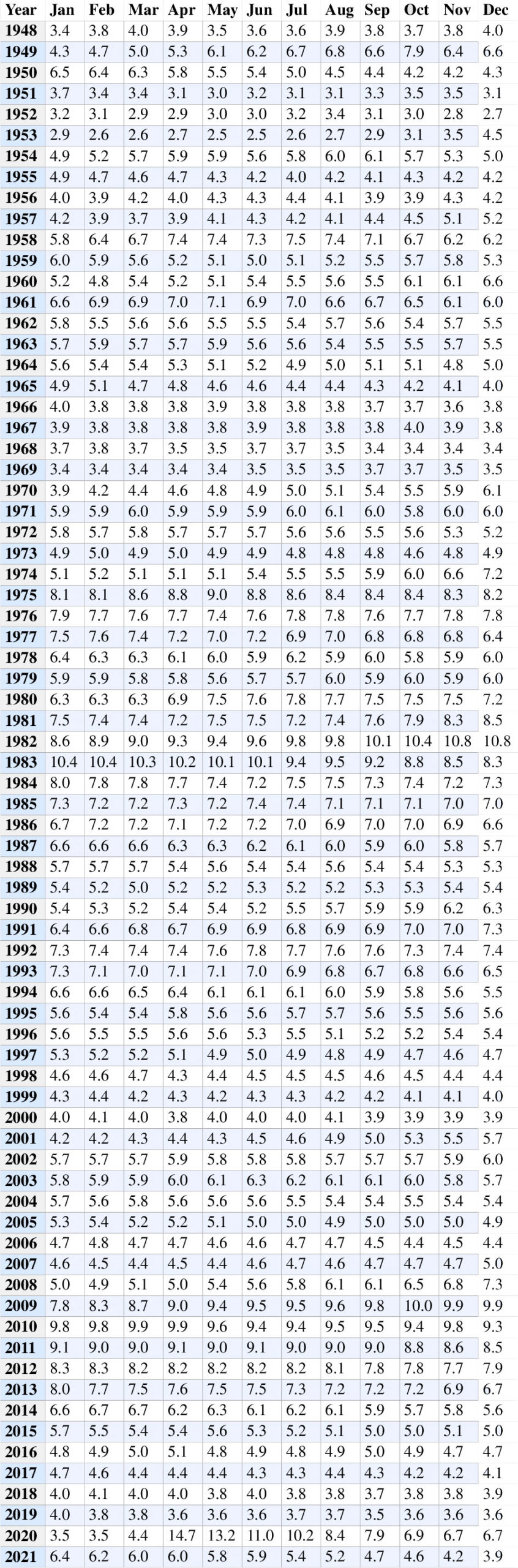
The Unemployment figures are also very important, but anyway slightly behind the Non-Farm Payroll. It is reflecting the people in labor force that are unable to find a long term job at that stage, of course excluding the old and the young, but very often, the time in between jobs are also calculated. That is when someone is satisfied with his job, when in economic bloom, he would quit the original job first in order to find a better job, but if the economy gets slow down, and his transition period would be longer and longer.
1) Deliberately unemployed
Meanwhile in the US society, white are always has a sense of superior, that is when they go to find a job, must be management level, at least officer or manager, or else they would rather be unemployed in order to wait for those positions. They would not like to be in a post of basic job, or else when they fallen into such a post, they are hard to climb up again. So they would rather like to be unemployed and receive Initial Claims then to work in basic labor force.
During a recession, female workers would not like to go out to work for a small salary; instead they would like to stay at home to take care of children. For when they go out, they have to calculate the cost of transportation and lunch, and clothing should be also counted for. But when economy recovers, they found the salary and type of works are attractive enough, so they would also like to go out to work.
Normally, the unemployment rate in Europe is higher, always at 7-10%, but the UK is the best among European countries which is always under 5%. In Asia, it is always better than western countries, and is just 3-4% on the average.
2) Full employment
There is also a term of full employment, it does not mean 100% employment, it is impossible. In America it is an unemployment rate as low as 5%, which denotes the best employment situation. Actually, this standard various from time to time. Anyway in America, when it reaches 5% or under, it is the best of times, but people are still working to get it lower. When it rises to 7% or over, it is a warning signal that recession is near. When it reaches 10%, it is an indicator of generating violence. That means a lot of family violence to woman or children will occur; and even gun violence will occur in the society. When it is over 20%, it is a disastrous indicator. In the Great Depression of 1930, the unemployment rate climbed up to 25% in USA and other countries up to 33%. In the Euro Debt Crisis of 2011, European countries like Spain and Greek were up to 24%.
When comparing with the Non-Farm Payroll, it is on the negative side that is how many people are unemployed, while Non-Farm Payroll is on positive side, telling how many jobs created. Therefore, Non-Farm is always more important. And as for points of fluctuation, normally, every time the ups and down will be of 0.1% or 0.3%, that is just 3 points are most and even in great turmoil, it is just 0.4 to 0.7%, and from 4 to 7 points are quite rare, only once in a decade or even less. While for Non-Farm, it always has several hundred points to fluctuate so it attracts market admiration more.
3) Financial Tsunami 2008 (Great Recession)
So let’s take a look at two different incidents which are the Financial Tsunami of 2008 and the Pandemic of 2020.
In 2007, oil price rose sharply to record high of $147 in summer. Unemployment rose from Jan of 4.6% to 5.0 or Dec. That is the rise is of 0.4% for whole year. But for Non-Farm Payroll, even though the previous years were all in positive. In Jul and Aug 2007 it showed negative. In Jun 2007 it is 76K and Jul is -31K that is only the change in one month is 107 points that is why the Non-Farm Payroll is much more admired than unemployment. The bankruptcy of Lehman Brothers was in Sep 2008 which marked the starting point of Financial Tsunami. Unemployment rose for 4 points instead of 1 or 2 points in the past. In Oct 2009, it reached the highest point of 10.0 and started to fall, while Non-Farm Payroll started to have positive figure which is +12K on Nov 2009. It marks the effects of recovery is on the way.
4) Circuit Breaker
So we took another example of the Pandemic in Mar 2020 which led to the Circuit Breaker of stock market. In Feb of 2020, NASDAQ was still on record high and unemployment kept stable at a flat rate of 3.5% from previous month. The Circuit Breaker occurred in Mar and unemployment rose sharply for 9 points to 4.4%. The real impact comes in Apr where it rose 10.3% points to 14.7%. This is the highest jump ever recorded in history. And in Non-Farm payroll, it’s roughly the same. In Feb, it is still +289K, but in Mar sharply dropped to -1683K, a drop of 1972 points, and in Apr it is -20679K, a drop of 18996 points, also the highest in history.
Therefore, to measure the employment situation, Non-Farm Payroll and Unemployment should put together to view as a whole and cannot just cut off either side.
Table (b) Unemployment
Besides Non-Farm Payroll and Unemployment, there is still one very important indicator that the market concerns most. The official term is known as Unemployment Insurance weekly Claims. However, the colloquial saying of the market is known as Initial Claims and Continued Claims. It is one of the very few indicators that release every week. By doing so, they are quite near to actual life instead of general indicators the only release just once a month.
In case of unemployment, the Initial Claims figure out the number of people newly unemployed and need to ask help from the government; while Continued Claims tells the number of people needed to help continuously. By showing the newly unemployed and already long unemployed people, thus the current situation can be understood more thoroughly. Its weekly data will be more near to the live situation thus always arouse certain turmoil in the market.
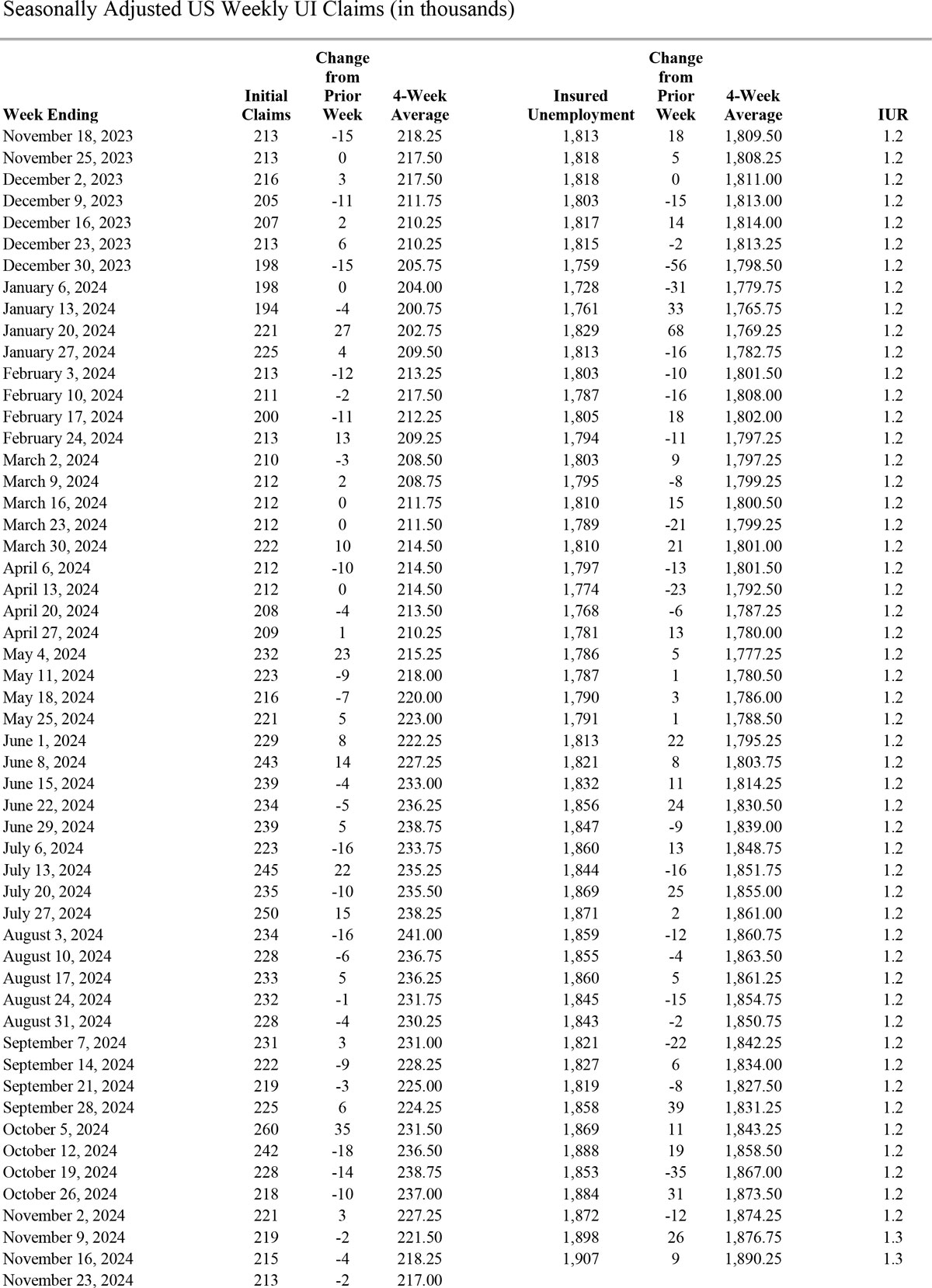
Normally, for market watching, what investors can see is just a figure, actually, what the Department of Labor release is a report of 10 pages, investors may not have time and patience to understand those 10 pages. But those who had read thoroughly surely should generate a deeper analytical power. That’s why when the same figure is release, some people can understand more and can grasp the market fluctuation and some cannot. Take the example of the release of Jan 20, 2022 (Thu). What investors see in the monitor is just a figure of 286K up 55K, but the full report is as following:
1) Original data consulting
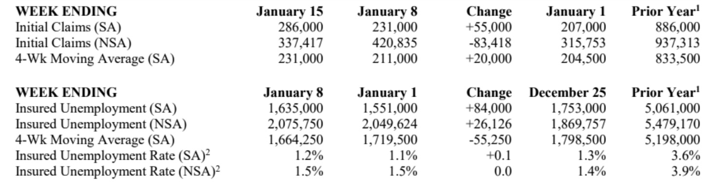
So let’s refer to the original document of releasing. The release date is Jan 20, but the period is up to the week ending Jan 15, the announced figure of Initial Claims (Seasonally adjusted) is 286K, when comparing with the previous week ended in Jan 8 which is 231K, the change is +55K the figure on Jan 1 is 207K and of the previous year is 886K. Further down the column is the Not Seasonally Adjusted (NSA) figure and the 4-week moving average of each figure. The second half is the Continued Claims which is announced one week later for it needs time to calculate. Basically, every week is presented in such a style. When investors can study once or twice thoroughly before the announcement, the understanding power and analytical power should surely be increased.
Please be also be minded something not listed in the above table, that is adjustment, normally, every time they would have some adjustment of the previous week, and the rise and fall of the new figure is fixed according to the adjusted figure and not this table.
Abbreviations in the table are explained as following.
SA – Seasonally Adjusted Data, NSA – Not Seasonally Adjusted Data, Continued weeks claimed represent all weeks of benefits claimed during the week being reported, and do not represent weeks claimed by unique individuals.
2) Adjustment
Again take the example of the first figure of Initial Claims, but if you figure out the summary, it is like this 286K, investors normally would have a good memory if they studied the report thoroughly. So when next time is announced as 290K, people would say +4K, at most of the time it is wrong. Why? For they will have the adjustment, the 286K may be adjusted to say 296K, so when this time is 290K, the fluctuation is fixed according to the latest adjusted figured of 296K, that is should be -6K and not +4K. At most of the time they would have changes in adjustment and when kept unchanged after adjustments is very rare indeed. So investors must also mind this.
As for forecasting, points to mind are the same as in Non-Farm Payroll. When news agency said after interview 50 famous analysts of Wall Street, they come to a conclusion of the range. The highest level is 350K and lowest level is 250K, so when the announcement is within these ranges, the fluctuation will be small or quite limited for already digested by the market. When beyond these of course the rise and fall will be greater. But sometimes not necessarily like this. As for the high low of figures, we cannot just take the arithmetical mean as the average, of course sometimes can, but not every time. After interviewing 50 analysts, they fixed the highest and lowest level, but may be 48 people out of 50 are having their forecasts around 340K to 350K, only 2 people are from 250K – 260K. Thus we have to know the weighted average instead of arithmetical mean.
3) Cross relationship
One more point is that, when investors observe the table for the economic indicators of the whole week, they should know it is compiled on Friday, before those analysts leave office, they sent the figures to the news agency. Readers read it on Monday, but when time passed to Thursday, its already several days, situation may change, other indicators may have released like the ADP, GDP, CPI, Trade Deficit…..so everyone must update themselves in order to chase up with time.
That man’s firstly must go deep into the background of the figures and cannot just pick up a simple average and secondly, when other figures announced it may also have some effect on the coming figures. This should be minded also.
4) Year 2021
Now, we have to have a live review of the Initial Claims in the year of 2021. This is a year which makes people inspired. It is hard to say which level is a nice standard, but from past experience, we can come to a rough conclusion like this. When the Initial Claims is under 200K, the society is in great prosperity or great recovery from wounds. When it is between 200K-300K, it is considered as a good record, in normal cases the economy is booming and when after wounds it is in strong recovery. When the figure is between 300K-400K, it is in medium level, no matter going upward or downward. When in the 400K-500K level, when economy is going downward, it is a serious warning signal of recession, when it is going upward from the bottom, it can be said the hardest time has already gone. Simply when the number is over 500K, it is in great recession, and when over 1000K, it’s disastrous.
For year 2021 on Initial Claims, basically, the whole year is governed by the pandemic. In early Nov of 2020, Pfizer/Biotech and Modern announced the successful development of vaccine, but in early Dec, it the UK that first started nationwide injection and US came several weeks later. Winter is the peak of Covid-19, and still a lot of partial lockdown carrying on in western countries, even though their lockdown is not as serious as that of China, but still a great hurt to the economy. In the whole year of 2020, the Initial Claims had been over 1000K for 20 consecutive weeks. The development of vaccine is surely great news; even the effect would not come at once, but the impact of good news makes the society full of hopes. That’s why the Initial Claims in early Jan starts with a number of 1082K and drops quickly.
It’s a simple trend that after the inoculation, a lot of people go back to work. Those that work from home gradually go out no matter for working or entertainment and the economy is recovering. However, there are still some points to note.
In the week ending Aug 14, 2021, the Initial Claims reached the low since the pandemic which is 349K. It is because summer is much easier to control the coronavirus, and inoculation had been carried out worldwide, and in some other countries, the injection rate is even higher than US. In early Oct, it even dropped down the level of 300K and continues to go down. It goes up a little in Nov as the variant Delta spreads, but the trend is to have record low since pandemic. In the week ending Nov 20, it even dropped under the 200K barrier and the lowest was in Dec 4 of 188K. Because winter is the peak of Covid-19 and of the Omicron variant, the Initial Claims on Jan 15 2022 is 286K.
For further details, investors can refer to the Labor Department and Bureau of Statistics, another venue is from the North, East, West, South is NEWS of The Express.
https://www.dol.gov/ui/data.pdf
The Initial Claims announced on 24th Mar 2022 for the week of Mar 19, 2022 is 187K, the lowest since 6th Sep, 1969.The landing of the Moon is on 20th Jul, 1969. The project brought about a worldwide economic bloom for years and hard to surpass for half century. But now it proves the economy is having a great rebound and that why the Fed announced to have 7 rate hikes in this year in Mar 2022.
Gross Domestic Product is probably the most comprehensive indicator of a country in the financial market. It reflects the whole economy for besides its own calculation, it includes a lot of other indicators including Consumer Price Index, Leading Indicator, Trade Balance, Unemployment, Non-Farm Payroll and Current Account. The announcement is also very special, each time is announced 3 times which is called Advance —– Preliminary (Provisional) —– Final.
1) Three announcements
GDP is announced in quarters, which should be four times a year, but actually each month they have announcement according to the above 3 issues. Since investors are keen to know the actual economic situation, so they do not like to wait for 3 months to see the final result, so that even the final result has not come out, the intermediate result is also much concerned. For example, the GDP of Jan, Feb and Mar is known as Q1, it is announced in firstly by the end of Apr. This time is known as “Q1 Advance”. It includes the employment report and other data. By the end of May, it is known as Preliminary, for it includes the Trade Balance. This figure must be based upon the shipping arrival of all goods, to ensure there is no mal-product and all goods are manufactured according to the order. Such as easy decay items like fresh sea food and flowers must be shipped in well conditions, and those that rejected to accept should be deducted. And if there is bad weather in midway and make the ships arrived later, it will be transferred to the figure of the following month. This second time is known as “Q1 Preliminary”. The 3rd time is known as Final, it is announced in Jun that is the third month of that quarter.
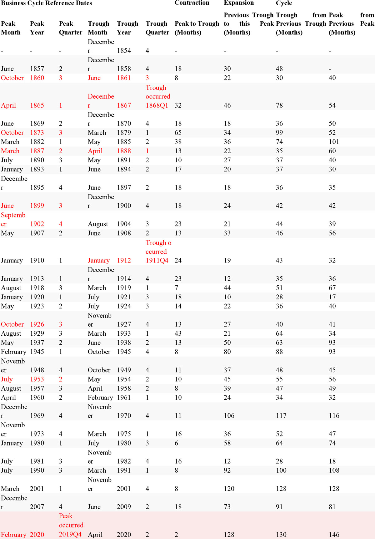
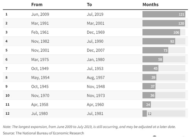
GDP can also be used to observe the recession and expansion of economy. A contraction in growth rate for 2 consecutive quarters is known as a recession. And if the both of the rates are already in recession and drops again, it is known as deep recession. Like that of 2020 Q1 and Q2, due to the pandemic, the US GDP from the 2019 Q4 of 3.6% 2020 Q1 -3.9% and Q2 -32.4%. The recession is quite great indeed. But we also have to know that before that, the US has a longest economic expansion from Jun 2009 to Jul 2019 which lasted for 121 months. The attached table below is from National Bureau of Economic Research; while the Bureau of Economic Analysis has another economic cycle is a little different from that.

2) Pandemic Effect
In order to make it brief and concise, we just watch the above figures from the pandemic. Covid-19 was detected in Dec 2019 in Wuhan, at first no one knew about the disease, only confined to a small group of people, so no effect to the society. In late Jan, the city of Wuhan was locked down and spread to rest of the world. In Mar 2020, there was Circuit Breaker in the US stock market, and the effect was seen in Q2 of 2020. The particular of Coronavirus is that in summer time, the virus cannot spread so wide, and development of vaccine was in good progress. Russian Sputnik V launched out in Aug, and Chinese vaccine in Sep, US vaccine successfully developed in Nov 2020.
UK is the first country to have injection on mRNA vaccine and started on Dec 2020, other countries followed. And in Q4 of 2021, the outbreak of Variant Omicron made people tried to co-exist with virus, which said to be the last round of pandemic and a lot of countries followed them to cut all pandemic measurements and thing gradually go back to normal. So readers can refer the pandemic to the GDP and thus can understand more.
When using GDP to measure the bloom and recession of a business cycle, it is closer than others, for a decrease in two consecutive quarters is regrade as a recession. However, if we view from a greater span, we should use the Business Cycle of Expansions and Contractions.
When referring to different economic indicators, the general situation of the society should also be minded for no indicator can stand alone. The best way is to study together with the Business Cycle of Expansions and Contractions. Thus readers can know how the economy rises from the low to the peak and down again. There are 4 stages in a cycle. Which are from peak to trough, after the peak the stage is known as contraction (recession) and then it ends at the trough. So the following stage is expansion and then peak, contraction, trough and expansion again.
Let’s take a look at the 9/11 New York Terror Attack. In early 2001, the US economy after 8 years of Bill Clinton’s presidency, which is known as an economic strong man, reached the top. George Bush took presidency in Jan 2001. The 9/11 terror attack occurred in Sep 2001, but it takes several months to prove the drop of economy and therefore entered into Trough in Nov 2001. From Peak to Trough it took 8 months and then from previous Trough to this Peak took 120 months. Investors can study the Economic expansion cycle together with GDP cycle and thus can have more understanding.
Thus we can carry on till the Financial Tsunami of Sep 2008. The loss of jobs did not happen in a single day, please refer to (i) Loss of jobs of this allocution. It covers a period from Sep 2008 to Sep 2010. Therefore the Trough Cycle starts in Jun 2009. The next cycle is on Apr 2020, for the Covid-19 burst out in and Wuhan is the first city that completely lockdown for it which is in Jan 2020. In Feb, stock market still make record high, but in Mar there is a great drop and led to Circuit Breaker, therefore, Trough comes in Apr 2020.
Thus we can see no matter on top or bottom of the cycle, it does not means it would match with the international happenings, always have a gap of several months later. Such like the loss of jobs on the first month is a small incident only, but when aggregated for several months, it proves the effect is greater and greater and cannot be limited shortly, and the Trough begins. So investors can use this as an example to view the other cycles and other indicator. When the basic theory is understood, it is easy to carry on no matter which cycle or indicator.
Contractions (recessions) start at the peak of a business cycle and end at the trough.
Business cycle data last updated: 07/19/2021
The red highlights indicate when the peak or trough month has been outside the peak or trough quarter.
Besides the above chart from the Bureau of Economic Analysis (BEA), there is another cycle shown by National Bureau of Economic Research (NBER) as the following, readers can made the study and research on their own.
Every indicator has their function and scope that needs to reflect. The society has different sectors and not just one or two indicators can reflect. Therefore we need to consult a lot of indicators and know their inter-relationship. No matter it is concerning jobs of general growth of a society, they cannot stand alone and must be referred to others. Of course it is impossible to list out all these and practically it’s no need for it will be very tedious. But investors can use such a method to understand other indicators like consumer sentiment, inflation or housing index…..etc
Besides analysis, application is above all. So how to apply? It is the greatest problem. After the research and analysis, of course there is a conclusion, but is the conclusion right or wrong, applicable to which market? Stock, currency, gold, future…..etc. The time of entering or leaving the market, too many things to mind can hard to fix an all in one guideline. Besides studying the whole volume of Electronic Handout and watch the Teaching Videos, the best way is to refer the daily bulletin The US Stock Express so as to catch the latest market trend.