
Key summary:
What is technical indicator? It is based upon a series of “calculation” to give definite figure or signal for buying or selling besides the traditional method of “observation”. Basically, chart reading can be divided into two major approaches which are by calculation and observation.
Traditionally, we use eyes to observe charts, but something is beyond observation visually. For each individual tool, it has its own advantage and disadvantage. Such as Wave Theory, it can have an extension when one thinks that the wave has fully completed. Chart patterns on Candlesticks or Bar Charts would also have transformation or distortion, that is they can gradually change to other patterns. That means there are a lot of grey areas. For example, a standard pattern needs a formation period of 3 months which is 60 transaction days. However, it is just an estimate, actually from 50 to 70 days can also be treated as a standard period. When using 70 to minus 50 that is 20 transaction days, it equals to one calendar month. That means the whole month is covered by the grey area, you can have your trading on the 1st or 30th day of the calendar month. When waiting for such a long period, not everyone would have such patience or even would go nervous, or even Schizophrenia. Actually, when one is involved in slight tension or mentally unstable, or not in well controlled manner for over one month, it is quite easy to go into the state of Schizophrenia.
Technical indicators would give a firm signal when the figures reach a certain point or having intersection, this is the function, and they can show the definite changing point clearly without any vagueness.
When learning Technical Indicators, there is a common question raised by investors. Which indicator is the best? Or which indicator is the most accurate? If there is such a model answer, then all other indicators will be wiped off at once. As in the NetDania chart, not so long ago, the total indicators shown were still under 100, but now is increased to 177 indicators and will be over 200 very soon. If there were really the most accurate indicator, why we still need the rest of 176 indicators, it’s a waste of time.
The most appropriate answer is that, in different time and different market conditions, we will use different indicators. Or when a complete wave cycle of wave theory is over, or when external conditions have great changes then we also need to change the indicators.
When to change the indicators? It depends on experience rather than theory and will be discussed in the advanced course.
Basically, there are two types of Technical Indicators, which are overlay and underlay. The former denotes those indicator are overlapping the price and shown in the chart as Moving Averages, Bollinger Bands and Ichimoku……etc. Underlay means they have a small rectangular Box under the chart to show the indicator according to the chart such a RSI, Stochastic and MACD…. etc.
Overlay can further be divided into two sectors, that is automatic and manual showing. Automatic means after you pick up the indicator, the computer will show everything for you unless you change the parameters. For manual showing, it means you have to use the mouse to fix the target, such as Fibonacci Fans, Retracements and Arc, you have to fix the top and low of the wave you wish to know about.
a. Bollinger Bands
Basically, market trends can be divided into two types, sharp running and sluggish. For sharp running no matter upward or downward, it is easier to grasp. For just predict the next week will go farther than this week, even in the middle may have some fluctuation. Even if investors are bounded, very soon can be loosened if it goes on the same direction. But sluggish is harder to grasp, for it goes up and down in a narrow range and sometimes may go further up slightly and turn back. When in such a case, the best indicator to use is Bollinger Bands. The formula for Bollinger Bands is as following:
BOLU=MA(TP,n)+m∗σ[TP,n]BOLD=MA(TP,n)−m∗σ[TP,n]
where:
BOLU=Upper Bollinger Band
BOLD=Lower Bollinger Band
MA=Moving average
TP (typical price)=(High+Low+Close)÷3n=Number of days in smoothing period (typically 20)
m=Number of standard deviations (typically 2)
σ[TP,n]=Standard Deviation over last n periods of TP
Investors need not to mind it so much at this stage. In the 1970s or early 1980s, there was no computer. Investors really had to use a calculator to work out the above formula day by day and plot it onto a graph paper. Now the computers are very powerful, you can just use the mouse to click on, and everything comes out at once. But if you work it out daily, your impression surely will be stronger and understanding power will be greater. However, nowadays investors are seeking quick success and instant benefits, just want to reap and do not want to sow too much. So we use the reverse learning method, directly go to the application, and formula will be discussed in the advanced course. And give up the traditional method of learning formula first and application second. All the rest Technical Indicators in this set of Electronic Handouts are the same. Application first, and formula calculation or research second.
It’s the application that can bring you profit in the market and not the formula calculation.
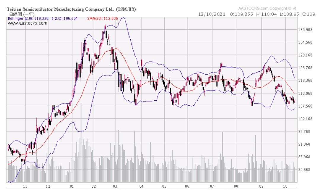
Figure (i) Bollinger Bands of TSM
Figure (i) the chart of TSM in Oct 2021, basically price will fluctuate between the bands, so when reaching the upper line or lower line, price will turn back. However, they would not turn back sharply at once, sometimes may penetrated several days before turning back, and that several days, the upper line will still move upward and lower line still will move downward. Therefore the indication is not so strong in a single direction market. From the above chart it can be seen that when in a sluggish market, the indication is much stronger.
Since April 2021, at most of the time when touching the upper or lower line, it will turn back within a few days. But in Dec 2020, after touching the upper line still gone up for one and a half month. So in such a case what should be done?
We can make use of the middle line which is the 20-day SWA. This line can be used as a watershed, when above it the market is looking bullish and when underneath it bearish. However, no indicators can be used alone, all indicators must be used interactively. That is must refer to other indicators at the same time.
b. Ichimoku Clouds
It is called the “Clouds” because prominently, there are two kinds of cloud can be seen, but besides the clouds, there are still 3 lines, it a combinations of indicators, so it is also known as “one look equilibrium chart”. That means it an all in one indicator, the basic function is to point out the turning point, also to forecast the future support and resistance besides the current.
It is composed of the following 5 major lines. Default settings are:
Tenkan-sen (Conversion Line): (9-period high + 9-period low)/2))
It is the midpoint of the 9-day high-low range in a daily chart. (less than two weeks)
Kinjun-sen (Base Line): (26-period high + 26-period low)/2))
The midpoint of the 26-day high-low range, (more than one month).
Senkou Span A (Leading Span A): (Conversion Line + Base Line)/2))
Mind that both of the Senkou Span A and B together formed the cloud and A is the upper bother line and B is the lower border line of the cloud. Senkou Span A is the midpoint between the Conversion Line and the Base Line. It is kwon as “Leading” because it is plotted 26 periods in the future and forms the faster cloud boundary.
Senkou Span B (Leading Span B): (52-period high + 52-period low)/2))
This line is the midpoint of the 52-day high-low range, which is a little less than 3 months. This value is plotted 26 periods in the future and forms the slower cloud boundary. It is also known as the lower border line of the cloud.
Chikou Span (Lagging Span): Close plotted 26 days in the past.
Let’s put the concentration on the clouds. According to the NetDania chart, it uses red cloud to represent uptrend and green cloud represent downtrend. Other chart may see different colors and some even use it in reverse colors. But as soon as you understand he basic theory, it is easy to grasp.
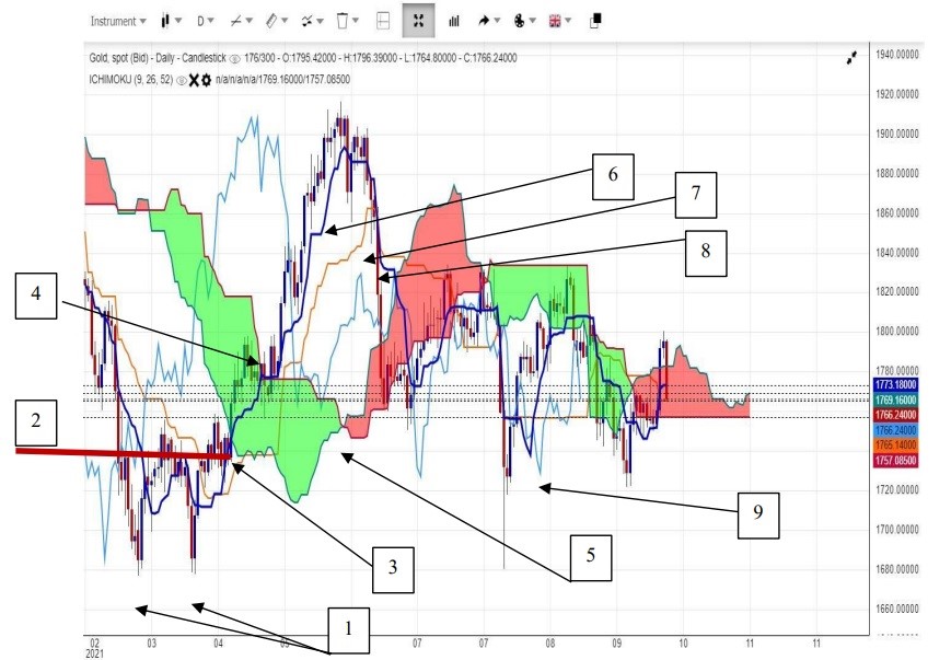
Figure (ii) Ichimoku chart of Gold
The chart of gold is shown in Figure (ii), we start at Mar 2021, the green cloud is falling but the gold price formed a double bottom (1). And gone through the top line of W shape (2). Then it goes up, the first resistance is at the bottom of the green cloud (3), but it penetrates easily, the second resistance is the top of green cloud (4), where it adjusts a little before reaching the cloud. It continue to go upward, and at the same time the future cloud turns from green to red (5), denotes the trend should rise after penetration.
As for individual lines, they also used as support and resistance and the intersection will have the same function of moving averages to show the change of a trend in additional to the cloud. The Tenkan Sen (deep blue line) (6) can be used as a short term support and when penetrated it denotes the short term trend ends. It is of 9 days which is nearly two weeks, The Kinjun Sen (orange line) (7) can be understands as medium term support. Kinjun Sen is the 26 day which is just more than one month. When Tenkan Sen falls down underneath the Kinjun Sen (8), it is also a selling signal. And when in downtrend the vice versa, support become resistance, selling signal turns to buying signal. Chikou Span (Light Blue) (9) is of the past 26 days. It cannot be shown on the current day, only can compare with 26 days ago.
Application will be shown in Teaching Video 8.
c. Parabolic SAR
Normally, technical indicators are telling investors which are the best time to buy or to sell, just like moving averages, Ichimoku or even different chart patterns like Head & Shoulders of Double Bottom or Top, or different kinds of candlesticks, they are all aiming to best recommendations. But Parabolic SAR is different; it tells when one is wrongly enter into the market what should he do?
Some people would say, if you found entered into the wrong direction, the best way is to cut lost. But……there is a very practical situation. The lost is not the same to everyone. That is when cutting a loss of 100 points, to a big shot is nothing at all, but to an individual investor it is a serious hurt. So what should he do? The term SAR means Stop And Reverse, that is when found wrongly purchased a product, after cutting loss at a level, can immediately sell down so as to gain back the loss. This is especially useful in trading of currency, bullion or futures, but for stocks still can be useful in short selling or for index futures. So even those not interested in short selling should know of such an indicator so as to broaden the horizon of trading.
SAR can be divided into rising SAR and falling SAR, the formula of rising SAR is as following:
Prior SAR: The SAR value for the previous period.
Extreme Point (EP): The highest high of the current uptrend.
Acceleration Factor (AF): Starting at .02, AF increases by .02 each time the extreme point makes a new high. AF can reach a maximum of .20, no matter how long the uptrend extends.
Current SAR = Prior SAR + Prior AF(Prior EP – Prior SAR)
Example : SAR = 48.28 = 48.13 + .14(49.20 – 48.13)
The Acceleration Factor is multiplied by the difference between the Extreme Point and the prior period’s SAR. This is then added to the prior period’s SAR. Note however that SAR can never be above the prior two periods’ lows. Should SAR be above one of those lows, use the lowest of the two for SAR.
And Falling SAR is
Prior SAR: The SAR value for the previous period.
Extreme Point (EP): The lowest low of the current downtrend.
Acceleration Factor (AF): Starting at .02, AF increases by .02 each time the extreme point makes a new low. AF can reach a maximum of .20, no matter how long the downtrend extends.
Current SAR = Prior SAR – Prior AF(Prior SAR – Prior EP)
Example SAR = 43.56 = 43.84 – .16(43.84 – 42.07)
The Acceleration Factor is multiplied by the difference between the Prior period’s SAR and the Extreme Point. This is then subtracted from the prior period’s SAR. Note that SAR can never be below the prior two periods’ highs. Should SAR be below one of those highs, use the highest of the two for SAR.
So the formula can be left for discussion in advanced course and let’s go directly into the application.
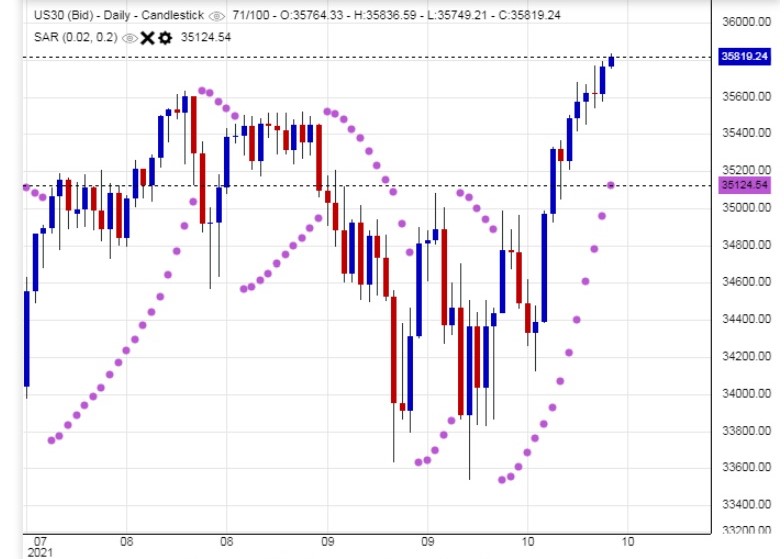
Figure (iii) Parabolic SAR of Dow Jones
Figure (iii) is the chart of Dow Jones, after the value of Parabolic SAR is shown as a round point in the chart. When it is under the price (index), it can be seen as a support, in a rising trend, the points will rise with the price. But it can be seen that at first the intervals are quite narrow, but when they grows larger, it means the end will come soon. As the price drops under the SAR, it is the time to cut loss and do the reverse at once, but it would not tell when the best time for profit taking is, investors had to decide on his own. But base on the theory of SAR, the guideline is to gain back what has lost, so the height of the highest point to the SAR point will be the depth of profit taking. That is if you sharply change your position form buying to selling at the SAR point, that is a loss of 50 points should take profit of 50 points, but if your reaction is slower, that is the price already gone down for 60 points; the profit level can only be 40 points. Practically, the price level can be more or less when with the help of other indicators.
From the above chart, it can be seen that sometimes a wave is quite long and sometimes quite short, so it should be used more in a more flexible way with other indicators. The writer would not suggest for short selling of US stocks as it is for professional traders or experienced traders only and not for individual investors. However, it can be used as a level of support or stop loss level at least.
d. Zig-Zag Line
Since the price of a product would not go straight up or down, normally it goes in a see-saw manner, thus the Zig-zag line is necessarily to point out the beginning or the end of a wave. For if the price is going up, it is very often will adjust for a while and then regains it energy to go up again. However, when it drops a little, some people would afraid the bear market comes, and sell out the product at once, after selling out it shoots up again.
The Zig-zag line is not a crystal ball to tell you when the market will turn up or down. It cannot accurately tell you what the future trend will be, but just fix a possible ratio of adjustment and when the adjustment is beyond that ratio it shows the turning point has already touched. Anyway, it can be also known as a point for stop loss practically.
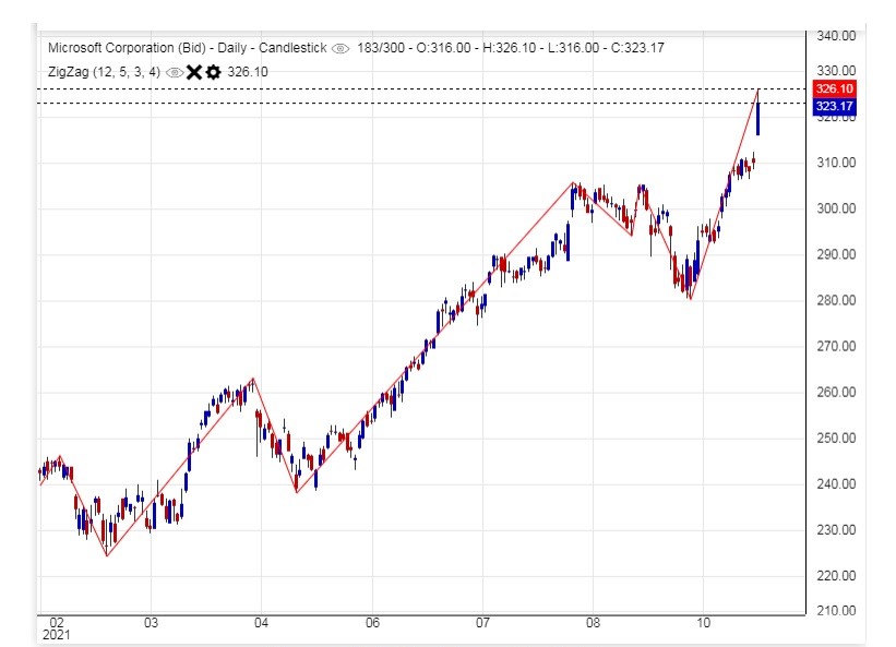
Figure (iv) Zig-Zag of MSFT
Above Figure (iv) is the Zig-zag line of Microsoft (MSFT), the basic theory is similar to the point and figure chart of last century. It is better used with Wave Theory. Mind that when it will tell you the changing of a wave, it cannot tell you the turning point, but after it turns for a period of time, it can confirm you that point is true or false.
Underlay does not mean the indicators are buried at the back of the prices. It actually has a small rectangular bow below the chart; the lines and figures are corresponding to the chart above day by day even though the price would not cross or penetrate the indicators, but would have special kinds of effect. Nowadays, computerized systems can also let investors to shift the underlay to overlay, but not suggested. Better go back to their original format so their functions can be easily seen.
a. Relative Strength Index (RSI)
RSI is among the most popular indicators and is widely used. Its basic concept can also be further to extend to other underlay indicators. Basically, it tells the overbought or oversold signals. The main concept is to find out the overbought and oversold period so as to make investor aware of it.
There is a rectangular box below the chart and the RSI is corresponding to the daily chart, showing an index from 0 to 100. When above the 50 point, it means the bull market or unfolding in a strong uptrend, when under 50 in bear market or downtrend. When over 70 points it is known as overbought zone, but just a warning signal, it does not mean it will turn down immediately, but the end is quite near, sometimes will turn down in just one or two days and sometimes may take up to weeks or months. The oversold zone is under 30 and vice versa. Recently, a lot of analysts extended the overbought and oversold zone to 80 and 20 because the market participants are more and more than before, and variants are more unexpected. The latter is seldom used, for RSI most charts still use the 30 and 70 as oversold or overbought level.
The formula is as followings:
RS = Average Gain / Average Loss
RSI has been broken down into its basic components: RS, Average Gain and Average Loss. This RSI calculation is based on 14 periods, which is the default suggested by Wilder in his book. Losses are expressed as positive values, not negative values.
The very first calculations for average gain and average loss are simple 14-period averages:
(1) First Average Gain = Sum of Gains over the past 14 periods / 14.
(2) First Average Loss = Sum of Losses over the past 14 periods / 14
The second, and subsequent, calculations are based on the prior averages and the current gain loss:
(3) Average Gain = [(previous Average Gain) x 13 + current Gain] / 14.
(4) Average Loss = [(previous Average Loss) x 13 + current Loss] / 14.
Furthermore, RSI can be divided in RSI 9 for short term and RSI 14 for medium term. These two lines can be put into separated boxes or in the same box. When two lines intersect over 80 points it is a strong selling signal and will fall deeper, but when under 80 points a weak selling signal and will just fall a little. When intersect under 20 points it’s vice versa for strong and weak buying signals.
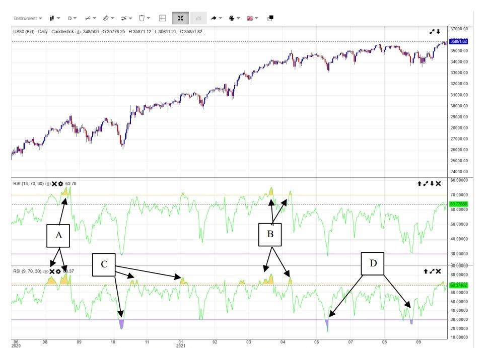
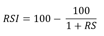
Figure (v) RSI-14 and RSI-9 of Dow Jones
Let’s go through the live examples one by one. Figure (v) shows the RSI-14 and RSI-9 of Dow Jones. So investors can compare the difference. RSI-14 stands for a longer period and thus signals are less than RSI-9, but the longer the trend the signal will be more stable and reliable. In Aug 2020, that is (A), it can be seen that RSI-9 is more sensitive and show buying signals earlier than RSI-14, similar things happen again in Mar and Apr of 2021.
But in Oct 2021(C), because of too sensitive, the signal that RSI-9 given are false signals. That is RSI-14 has not reach the overbought or oversold zone, so no need to buy or sell. Again selling signals of Jun and Aug 2021 of RSI-9 are all false signals because they are too sensitive, while RSI-14 had no signals that should be correct.
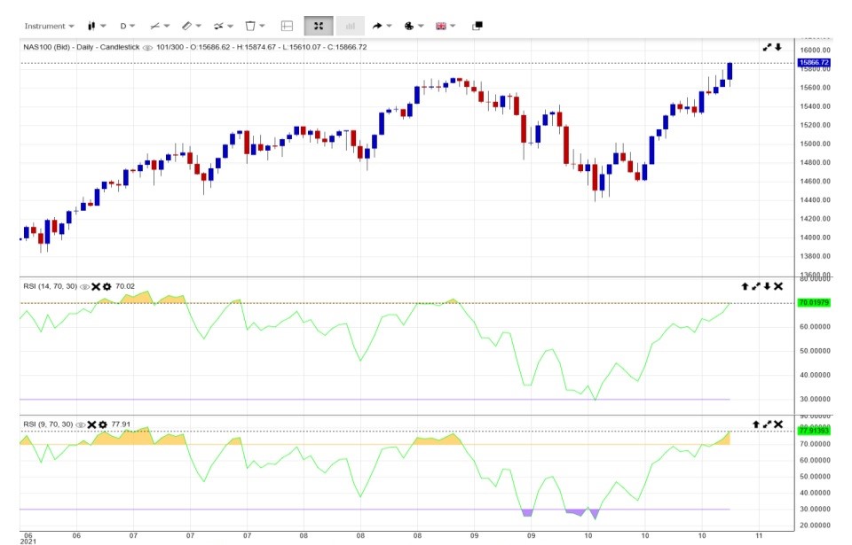
Figure (vi) RSI-9 & RSI-14 of Dow Jones
So come to a live situation, by the end of Oct 2021, when RSI-9 is oversold, but RSI-14 has no signal, what should investors do? Can we continue to buy in? We call this trial buying. When it is of a longer time, we surely has enough room for liquidation, for the rising trend is steep enough and thus can try, but should have a stop loss at the level when RSI-9 goes out of the overbought zone which is 70.
Figure (vii) Overlay of RSI-14 of Nasdaq 100
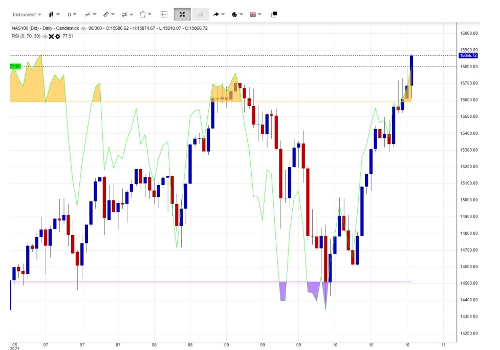
Figure (viii) Overlay of RSI-9 of Nasdaq 100
Mind that the Nasdaq 100 is drawn on the same day of Dow Jones so that it is the most practical way for comparison besides using other indicators. In Figure (vii) even if it has a big white candlestick on the last day, the RSI can be seen still under 70, not yet overbought, while in Figure (viii), it is clearly overbought, but when comparing with the previous wave, it is just slightly overbought.
People may ask, as in the moving averages, the use integral number as such five or ten lines 10, 20 50, 100, 150…..when in RSI uses 9 and 14. It comes from the Fibonacci series of 1, 1, 2, 3, 5, 8, 13. They just pick up 8 and 13 as a whole series and thus the following day is a turning day which is 9 and 14.
b. Stochastic
After understanding the RSI, it is quite easy to understand the Stochastic. Basically, it is a rectangular box underneath the chart and the index is from 0 to 100 as RSI. The Stochastic also have the overbought and oversold zone and normally use the 80 as overbought and 20 as oversold.
It is more indicative when using two lines which are known as %K and %D, when entering the overbought zone, it is only a warning signal, it’s not a time to sell, but when %K and %D intersects in the overbought zone, then it is a strong selling signal. But if it intersects and not yet reached the overbought zone, just say at 60 points, it is also a selling signal, but weaker. The higher the numerical value, the stronger the selling signal, which means can sell in a larger amount of quantity and deeper in price level. Therefore if it intersects say at 40 points, still can sell, but should take profit as soon as possible. For oversold signals it’s vice versa at 20 points.
The basic formula is
%K = (Current Close – Lowest Low)/(Highest High – Lowest Low) * 100
%D = 3-day SMA of %K
Lowest Low = lowest low for the look-back period
Highest High = highest high for the look-back period
%K is multiplied by 100 to move the decimal point two places
Stochastic can be divided into Fast, Slow and Full versions. Fast version is for short term purpose and have more signals, Slow version is for medium term the signals may be just several times a year. Not so much, but more accurate. Full version is based on Slow Version but look back of the %K and %D, and can be seen as an average.
One thing very important is that, the total response is slower than the price. That is indicator cannot tell the turning point in advance, but after the turning appeared, it can confirm that point is true, when it is not confirmed, we still have to wait for confirmation. When without confirmation, it may be a false signal or a signal not firm enough. So it bring about another problem, when you want to buy in, the price may have risen a lot in order to confirm, so investor should not mind that, better look forward. But when selling out, it also have to drop for a certain period in order to confirm, so it is not suitable for short term buying or selling, or else the period wait for confirmation may be equal to the profit.
To overcome this, after buying in, cannot wait for selling signal of the wave, have to decide to liquidate when the price is high enough, do not wait for the falling.
So let’s have a review one by one on the stock of NVDIA Corporation (NVDA).
In Figure (ix), it shows the Stochastic Fast and RSI. The price of NVDA already gone over the overbought zone and the big white candlestick is even higher than the shaded area of RSI. This is shown in (A). But the Stochastic Fast is more sensitive, intersect first at (B) shown short term selling signal and since it’s already at top so the following signals go horizontally. Even the price rises higher than before, but the top of Stochastic Fast is the same as before, it means the rising energy is decreasing (C). And when the indicator is not in the overbought zone, still can sell, the price still will go down, but just a little (D). So must liquidate at once.
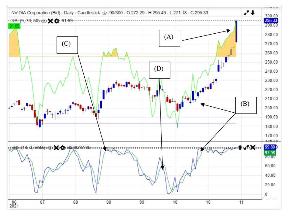
Figure (ix) RSI and Stochastic Fast of NVDA
For Figure (x), Stochastic Slow is added in addition to the previous chart in the lower box. It can be clearly seen that the signals are less than Stochastic Fast, that is it filtered out unnecessary signals, therefore should be for medium term to longer term purpose. It can be seen that in (A), even the price rise higher, but the signals lines are of same height which means the rising power is weaker. Because unnecessary signals are filtered out, so it can be seen more clearly. On the last wave, the mouth of the two signal lines are much more wider apart which means the rising power is stronger and at length erected a big white candlestick.
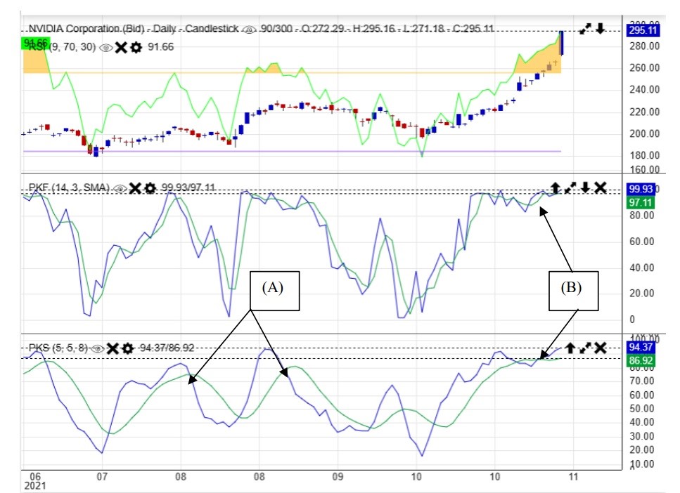
Figure (x) RSI, Stochastic Fast and Slow
For Figure (xi) Stochastic Full is added, it can be seen the two signals lines are kept closer and thus can show the bottom or top clearer than the Fast and Slow version. Even the price is lower, but the bottoms are nearly the same in (A), that means the fall is going to an end and the rise will come soon. But when comparing with the low, (B) is lower and (C) is higher, this can be seen clearly when go back to Figure (ix), that means the falling power is weak and the rise will come soon.
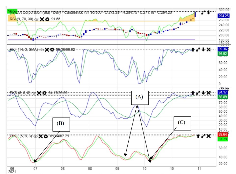
Figure (xi) RSI, Stochastic Fast, Slow and Full
c. Moving Average Convergence and Divergence (MACD)
MACD is a modified version of RSI and Stochastic. For RSI the range of index I from 0 to 100, so when it reached the top of bottom, it can stay in 100 or 0 for several days and those days would not have any indications. But for MACD, the baseline is 0, it can go up to positive or negative level infinitely. This is very useful when comparing with the previous high or low, no matter in medium or long term. The zero line can be understood as the 50 point line of RSI and Stochastic which is the watershed of strong trend and weak trend.
Actually, the zero line also have forest bars pointing upward and downward to show the price is changing from weak to strong or vice versa. In addition, there are two signal lines of EMA periods, when the two EMA period line intersects it is also a signal of buying or selling.
The basic formula is
MACD Line: (12-day EMA – 26-day EMA)
Signal Line: 9-day EMA of MACD Line
MACD Histogram: MACD Line – Signal Line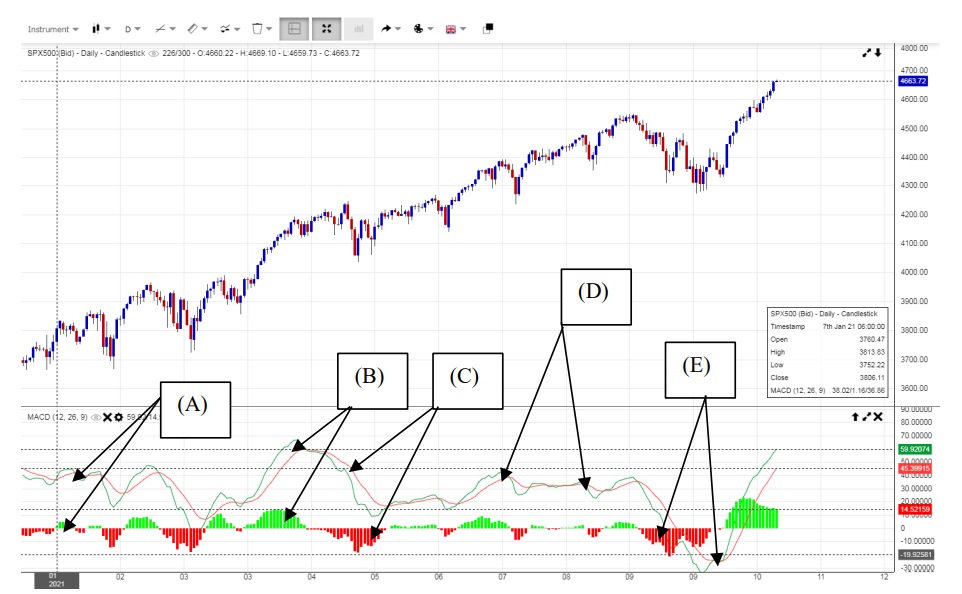
For research of formulas can leave it to be discussed in advanced course and now we go directly into the application.
(1) When the signal lines intersect, originally it is a selling signal, when the forest chart underneath change from positive (green color) to negative (red color), originally it is also a selling signal. However, this time is an exception. The forest bars are so short that means the power is weak and when changed to negative we still need to confirm. When the bars are shuttling up and down the zero line, the indication is quite weak and has to observe further.
(2) As the price rises, the peak of the signal lines is higher than the previous top, that means the rising trend is quite strong and will rise further.
(3) The price continues to drop and signal lines continue to go down, but the red forest bars is shorter and shorter, that means the drop will end soon or another rising wave is on the way.
(4) When the price goes up but the top of signal line is lower than the previous, it means the power of uptrend is weakening and adjustment is near.
(5) When the signal lines penetrates the zero line and turned from positive to negative, it means a deeper adjustment is on the way. But when it intersect in the low and forest bars turns from negative to positive it means another upward wave starts.
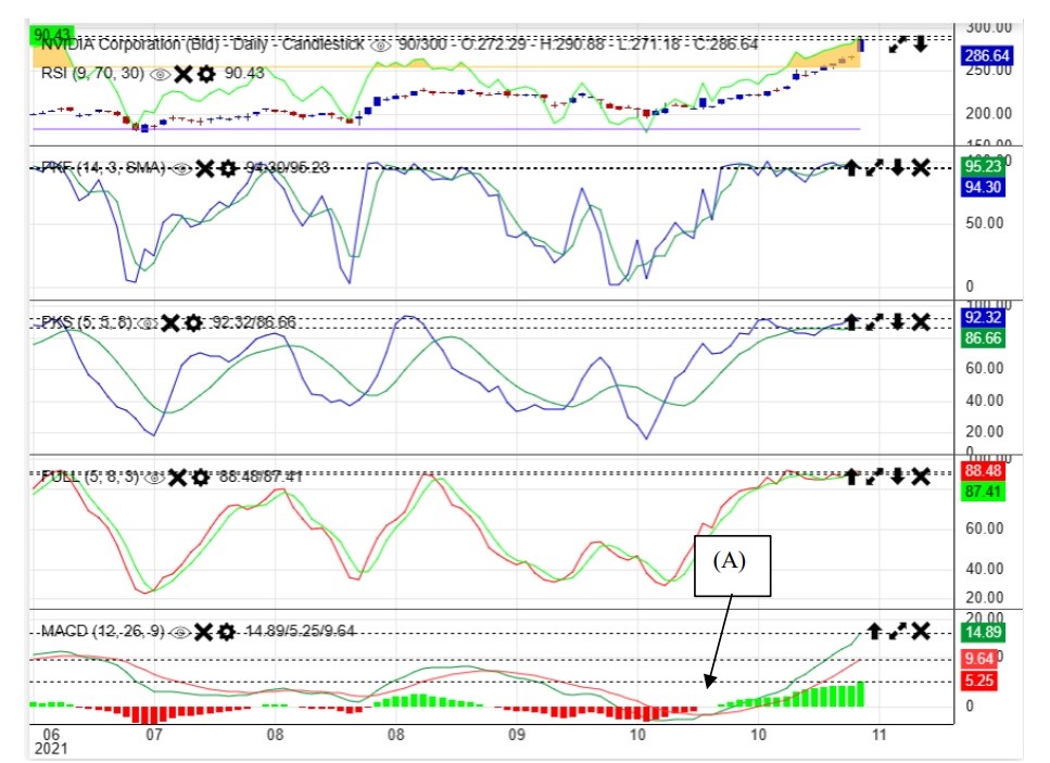
Figure (xii) MACD, RSI, Stochastic Fast, Slow and Full
This chart adds the MACD to compare with the others, but the focus is that the middle line is zero and have no upper limit and lower limit. For stochastic is fixed between 100 and 0. Thus on the last wave, it can be seen in (A), it has the sharpest rising trend to show the strongest rising wave in this chart and at length formed the big white candlestick.
There are still a lot of useful indicators, but if you can understand essence, all others are roughly in the same concept. Basically, they cannot be used alone and should be inter-related. More application will be shown in advanced level course and Teaching Video.